CITYTV APP
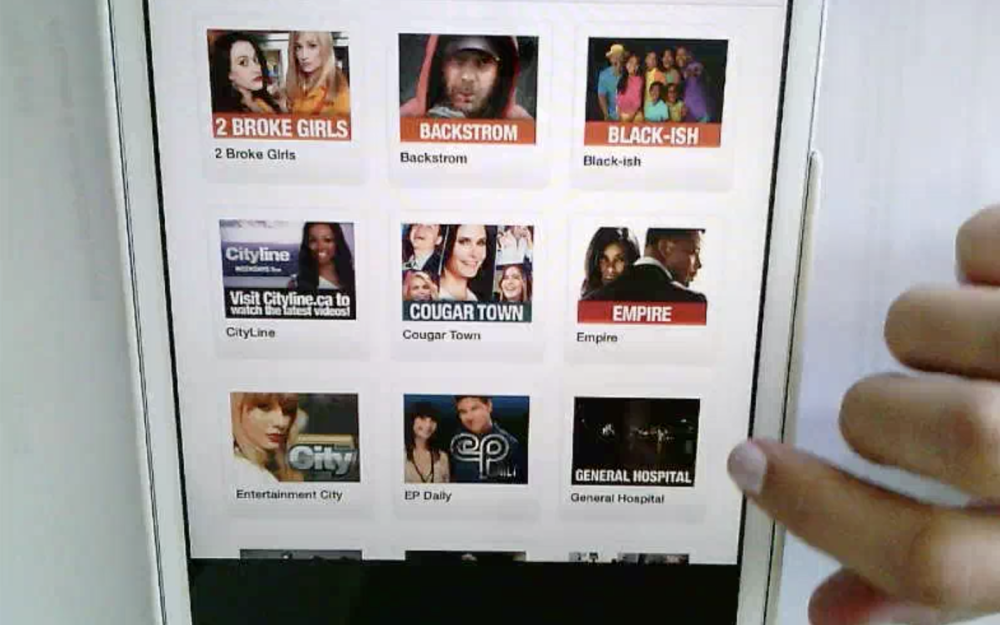
CityTV is a Canadian television network owned by Rogers Media and has a full line-up of some of the top TV shows. As part of Rogers, I was tasked with the redesign of the CityTV app for iOS and Android. The existing app was launched in 2010 and in dire need of an overhaul to say the least.
MY ROLE
My role consisted of everything from strategy and testing to UI/UX design. At Rogers media, our team was essentially an agency that would take on website or app projects for brands like City, Today’s Parent, Sportsnet and more.
THE PROBLEM
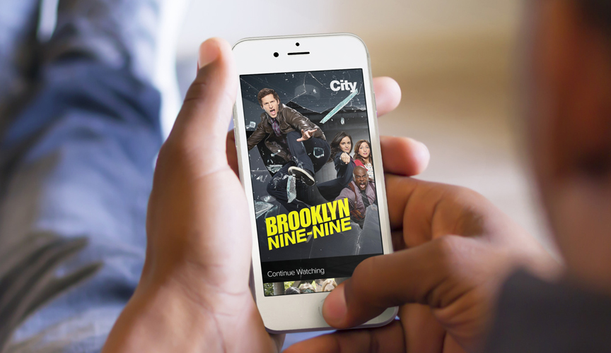
The problem this app was solving was allowing users to watch their favourite shows on demand, anytime, any place. The existing experience was dated, flawed and was therefore causing customers to retreat to other means of consuming content. As a result, the City brand was becoming tarnished, app store reviews were as low as they’d ever been, users weren’t engaging with the app but loved its shows as content.
There were a number of challenges on this project that were uncovered through research such as not having AirPlay support for mobile devices, showing too many video ads during playback of a show, or even more development-orientated problems like the app not responding or crashing during use.
Success meant an increase in app downloads and usage, an increase in video consumption and engagement and the revitalization of the City app.
DESIGN PROCESS
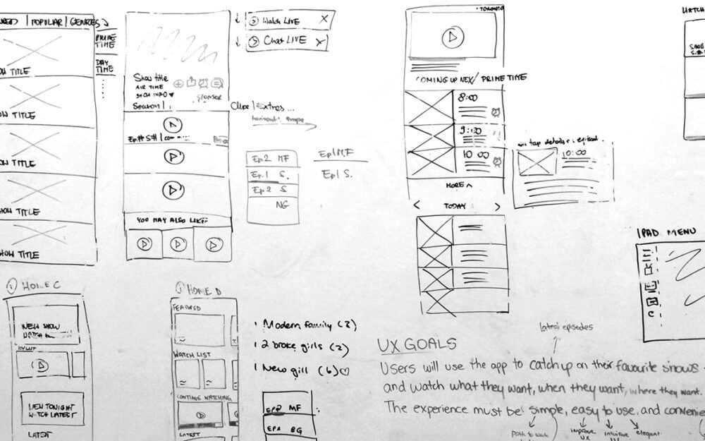
The process included a research and discovery phase prior to build to help define and determine the experience and prioritize what features to build. I looked at things like market research, user pain points, analytics to see where time was spent on the existing app, user surveys, guerilla testing and finally, solutioning.
Example strategy artifacts
Market Analysis | App Reviews | Surveys | Guerilla Testing | Rainbow Diagram | UX Recos | Personas | Experience Brief
SOLUTION APPROACH
Research helped validate assumptions, gave insight into designing the best possible product and helped prioritize the scope for this application.
If we knew users were using the app to catch up on the latest episodes of their favourite shows, we would need to create an experience that will make them want to use it.
A focus on surfacing relevant content for users.
Users were using City as a means to catch up on the latest episodes of their favourite shows. CityTV doesn’t season stack shows and because of this, discoverability of shows users have never heard of were less important. They were just more interested in being able to quickly access their favourite shows and had some interest in watching related shows to the one they’ve just watched.
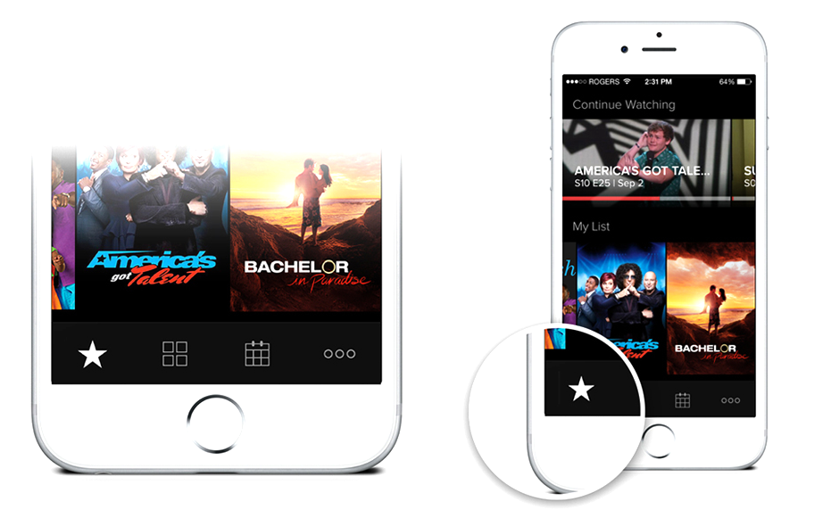
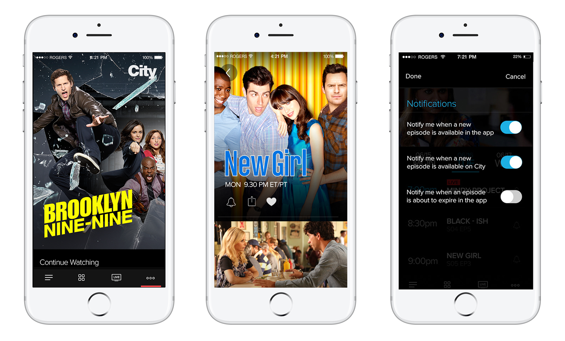
- MyList: I experimented with allowing users to “heart” their favourite shows and have them build up their “my list”.
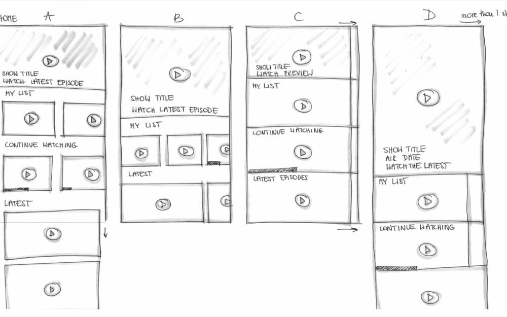
- Home Screen Algorithm: On the home screen, the main carousel would only display shows that the app knew they liked based on their behaviour. If we knew they were watching Brooklyn Nine Nine a lot, we would override the default home screen main show in the carousel with curated content based on their behaviour. Other things like, “My list” was ordered based on video consumption behaviour and updates to the video player were made as well.
- Notifications: The notification experience was enhanced and would now alert them when a new episode of their favourite show was just published.
A focus on giving users a wonderful viewing experience.
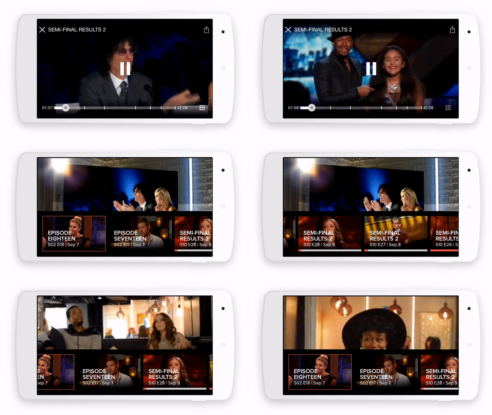
The video experience was a key value proposition. Users wanted their watching experience to be prioritized. One of the main pain points was that users weren’t able to resume a video after the app crashed, or if they were to switch between devices while watching. Below are some of the items we focused on in our solution:
- Continue playing: We added a “continue playing” section on the main screen which would allow users to dive back into shows or episodes that they just finished watching.
- OmniChannel: We incorporated an OmniChannel experience that would “talk” to your web/mobile/AppleTV experience. For example: if you started watching a video on your iPhone and paused, you could log into AppleTV to finish off the episode.
- Video Autoplay: We needed to add things like autoplay at the end of each video which would send them off to the next video in queue before they could cancel, to increase binge watching of course. These videos had an algorithm that would display the next episode of that show, or a relevant show if there aren’t any more episodes available.
- Video Playlist Carousel: I experimented with adding a shelf/carousel that the user could use to swipe up at any point during a video to move to another video in queue.
A focus on better content hierarchy and information architecture.
It was difficult for users to find the content they were looking for. Improvements needed to be made like how things were grouped and labelled within the application, to overall layout enhancements that would help guide users to finding relevant content.
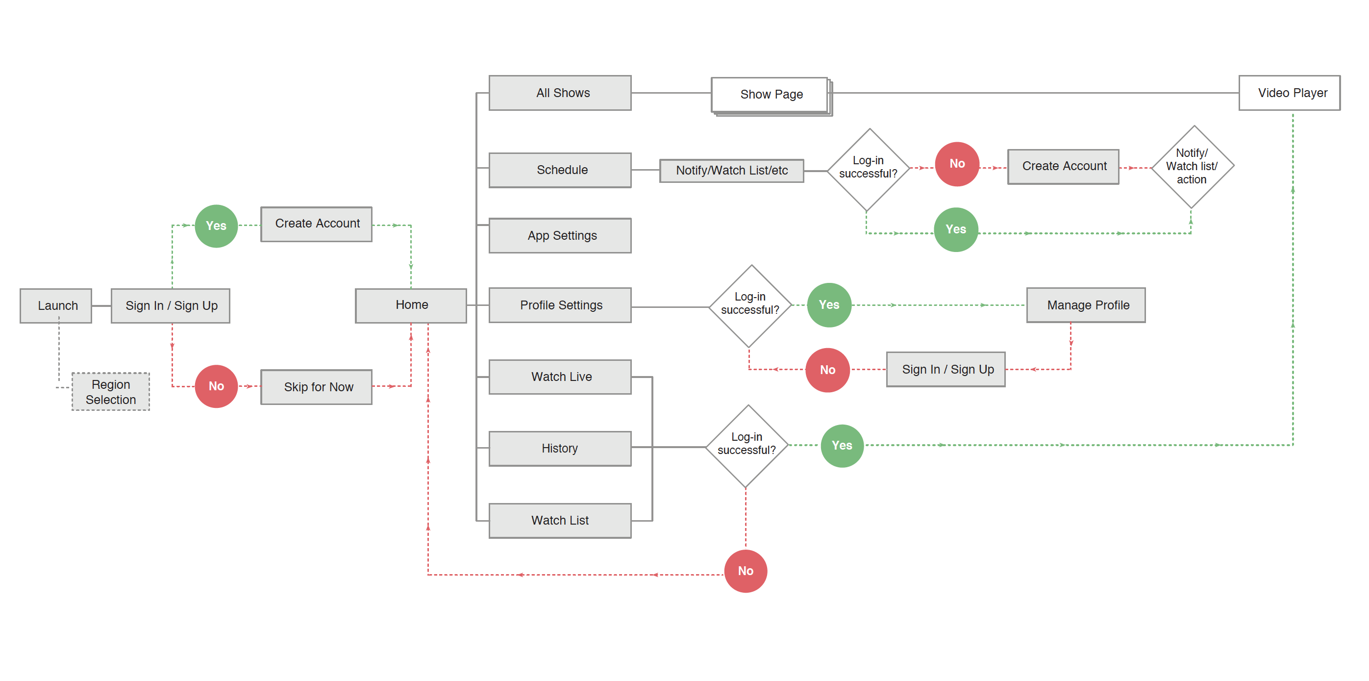
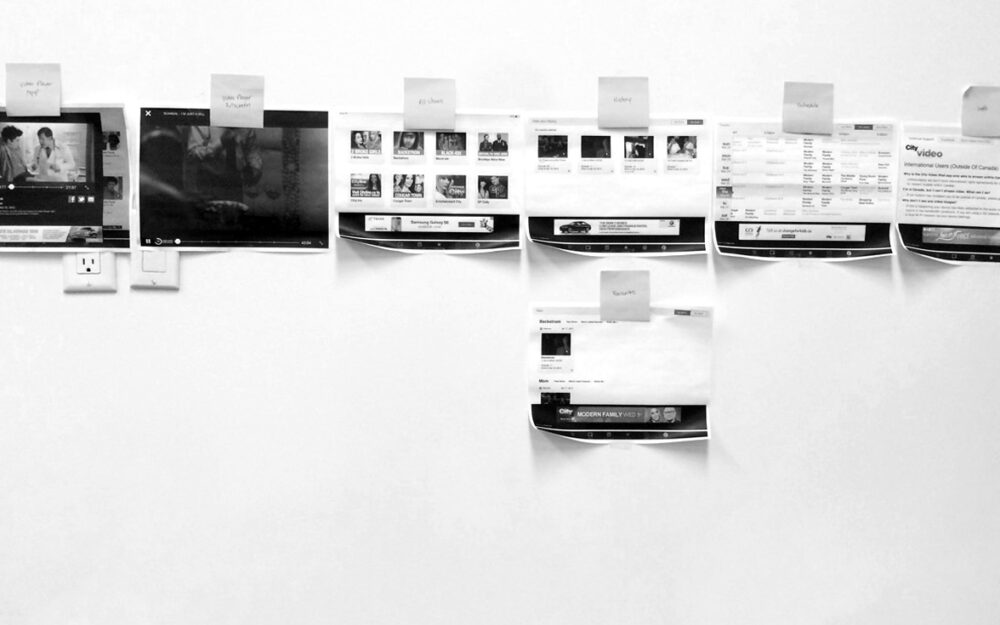
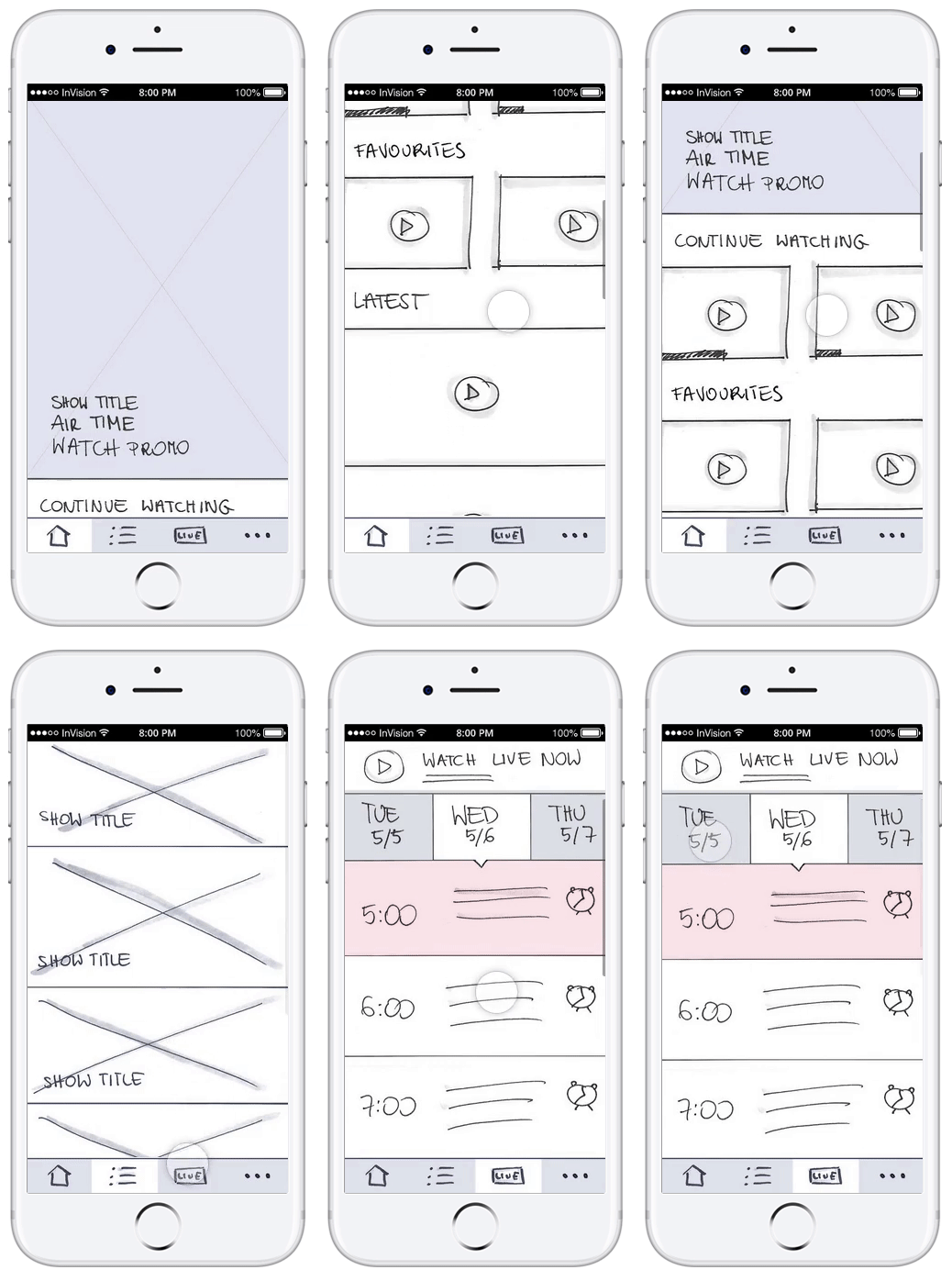
A big focus was placed on creating page description diagrams and running card sorting exercises with stakeholders and team members. Redefining the navigation structure and flow was also key in allowing users to make the experience consistent, easy-to-use and would get them into the content they want right away.
CHALLENGES
Sometimes there are limitations that are out of your control on projects. Many users were frustrated with the fact that CityTV app didn’t offer season stacking for their customers, or the fact that there were too many video ads during playback. What about not being able to Airplay or Chromecast from their mobile devices to the televisions? Frustrating? Indeed!
My approach to these sets of challenges was to present my findings to the business, advocate for the user and plead my case. The business understood and agreed with my findings, but unfortunately couldn’t do much about these challenges.
Most of all however, what’s most challenging is when you know the simple truth that these sets of constraints will limit the impact of the amazing work you’re now doing for the product. I’ve learned that as a designer, we must always advocate for our end users’ and recommend the best approach that follows good practice and we’ve done our due diligence.
