ROGERS NHL GAMECENTRE LIVE – User Testing (Version #1 & #2)
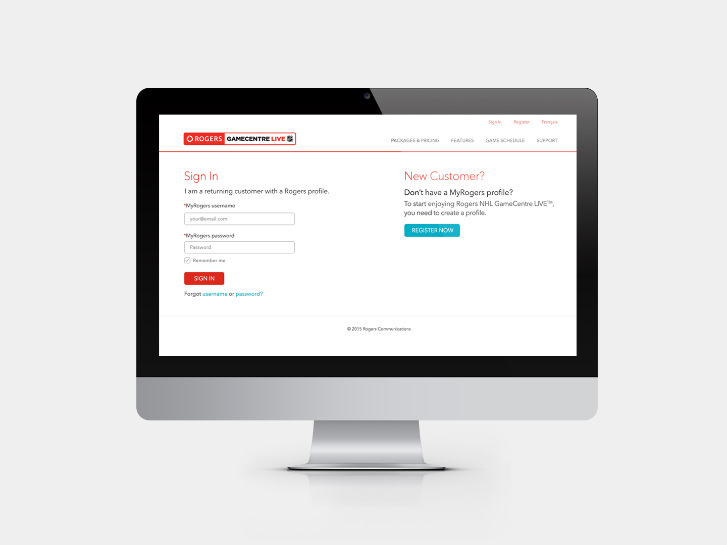
Rogers and the NHL struck a 12 year deal that would allow Rogers exclusive rights to air all NHL games on Sportsnet. I was responsible for designing an experience for Rogers and Non-Rogers customers to sign up and/or gain access to Rogers NHL GameCentre LIVE. In addition to signing up for the service, they could view schedule info, pricing info and explore more of the features of the website.
This case study focuses solely on outputs from the user testing that took place as part of a research phase. User testing commenced post-version #1 launch of the web portal in an effort to address usability concerns and the needs of users. This case study will show elements of the design prior to testing (Version #1) as well as elements post-testing (Version #2) through design iteration and insight from users. Ultimately, there was a third iteration (Version #3) that was launched but I will cover this in another case study.
I have broken it out into three key problems that were identified and therefore addressed as part of the user testing conducting.
PROBLEM #1: The product is not clearly defined.
The first problem that we encountered was that users didn’t understand what Rogers NHL GameCentre Live is. So, it begs the question, well… why? Why do they feel this way? What don’t they understand and really, how can and will we resolve this problem?
BEFORE
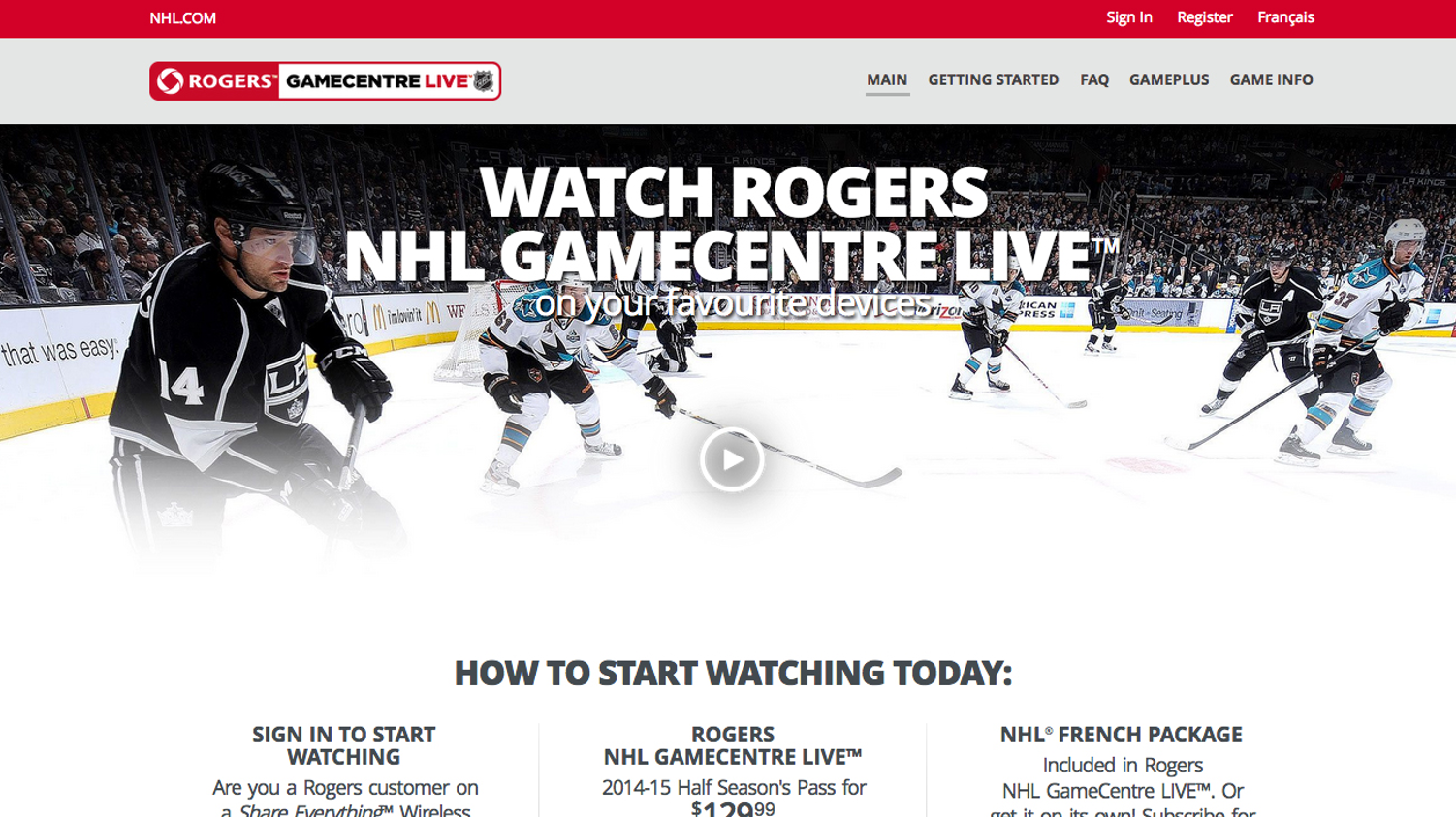
- Main heading: The main heading doesn’t describe what the product is and is confusing to users. It doesn’t describe what the product is, what benefit users will gain from using the product and is actually pretty vague in a sense. It doesn’t sum it all up very well.
- Background image: The background image doesn’t help support what the product is. Also, although the background image does scream ‘hockey’ and it works visually, it doesn’t help users understand what Rogers GameCentre Live is.
BEFORE
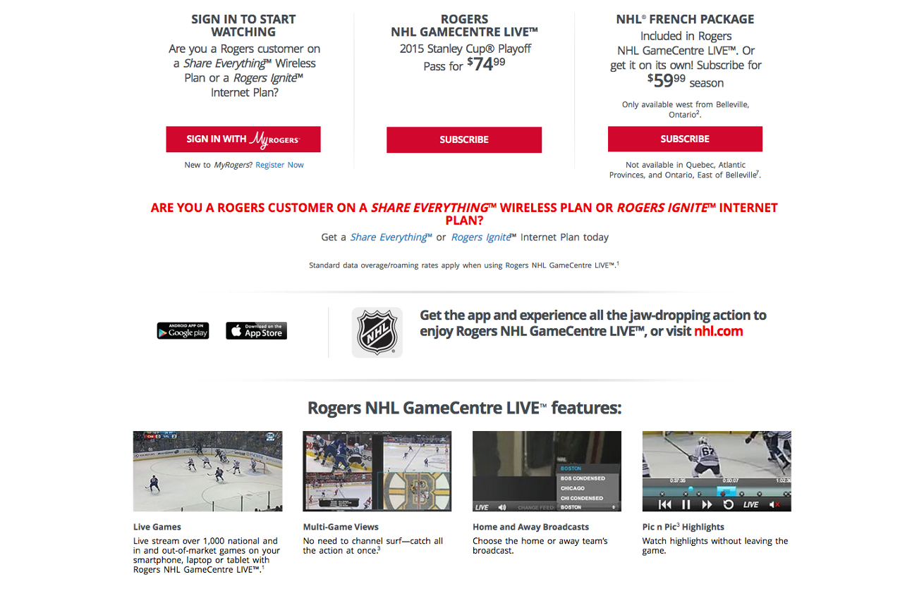
- Not informed before purchasing: Here, we didn’t do a very good job at telling a story to our users. What was happening was that users would launch the website and first look at the pricing and package information before understanding what it is. So we really didn’t give them a proper introduction and things escalated too quickly sort-to-speak.
- User Quotes:
- “It allows me to watch games… select from all different games that are airing on Rogers main plus Sportsnet networks.”
- “It looks like it allows me to see it up-close from a referee’s point of view. That’s pretty much it.”
- “I think GameCentre Live is a hub for hockey stats, replays, news, rankings, etc…”
BEFORE
- Confusion surrounding the homepage video: The homepage video doesn’t explain what the product is. In the header on the homepage, the main video was actually an extension of the marketing campaign and TV ad that was launched, featuring Mark Messier. It doesn’t do a good job at explaining what the product is, and how users can get started with it. From the results of the study, users said things like “I couldn’t remember what exactly he said on the commercial – I only remembered NHL and Rogers from it.”
- Background image: The background image doesn’t help support what the product is. Also, although the background image does scream ‘hockey’ and it works visually, it doesn’t help users understand what Rogers GameCentre Live is.
AFTER
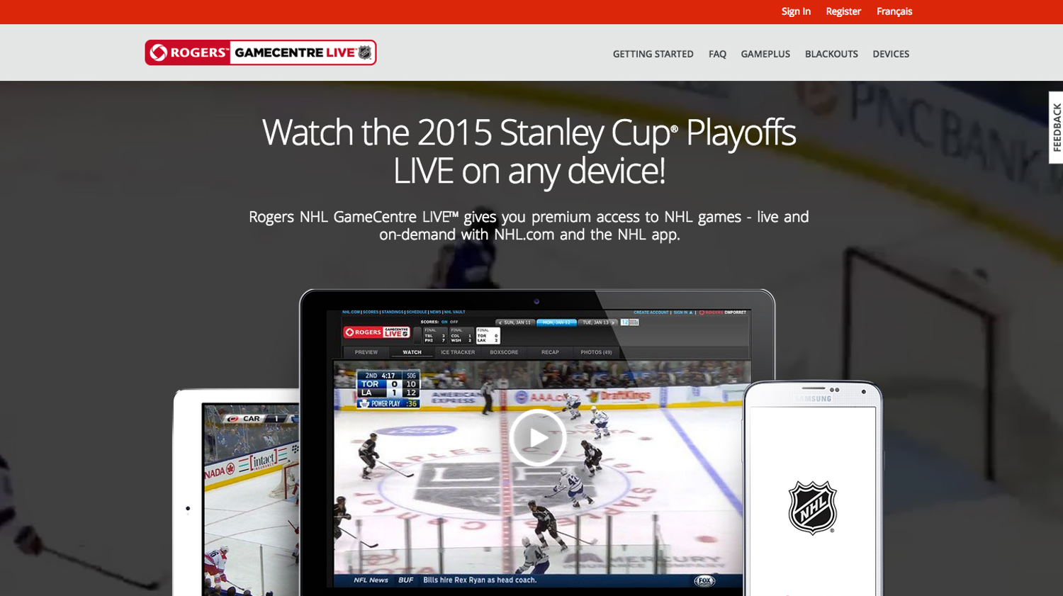
- Confusion surrounding the homepage video: So… how did we try and resolve this issue? We clarified the copy in the heading to be more clear for our users. Now it describes what the product is, and what benefits you’ll get from using it.
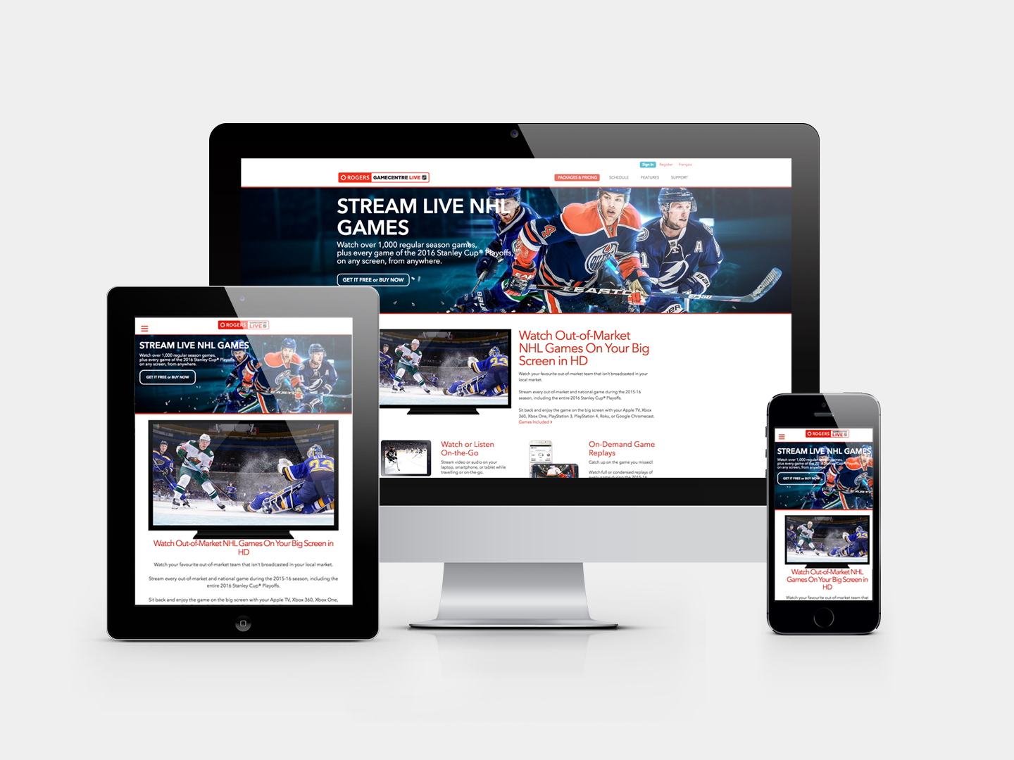
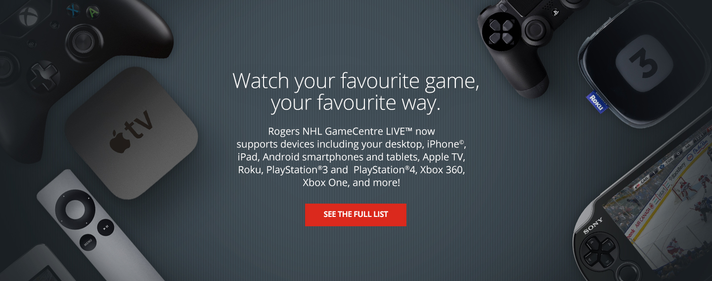
- Device images help support what the product is. We’ve added device images to the hero image that help sell what the product is. It also tells users what platforms they can enjoy Rogers GameCentre LIVE on and gives them a visual reference.
- Background video was added to give users a sense that they’re in the right place. We added a background video of a live hockey sequence that gives users a viceral sense that they’re in the right place. It also excites users and again, helps support and sell what the product is.
- A new video was created that does a great job at explaining what the product is. We’ve added a new video that help explain to users what GameCentre Live is, how they can get started, the benefits and how awesome of a product this is!
PROBLEM #2: Pricing and packaging language/options are confusing to users when determining eligibility.
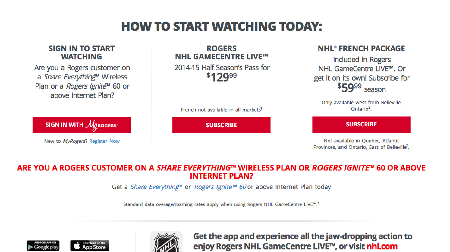
So, the second major problem from the study was that the pricing and packaging language and options were just too confusing to users. When users were asked to determine their eligibility in the call to action/pricing area, 70% of users actually failed the test. So, why were the results so poor? What part of the language or options were confusing to users?
BEFORE
- Users did not know what type of plan they had: Users were generally confused with the language in the first section. They weren’t sure what type of plan they were on, and were confused with where the sign in button was going to take them. I’m not sure how we would expect users to understand what a ‘Share Everything’ or ‘Rogers Ignite’ plan is. Since working on this project, I’ve probably asked all of my family members at friends what plan they’re on, and almost always they tell me they don’t know. Then, the Rogers employee inside me pitches GameCentre Live to them and tells them freaking awesome of a product it is.
- Confusing language: Also, things like ‘What is an Above Internet Plan’, ‘Would a Full Season’s Pass be double the price’ and ‘Is the French package an add-on’ were all things that users said because they just didn’t understand the copy here. For example: they assumed a full seasons pass would be double the price of the half seasons pass.
- Users thought they had to choose between price options and said they would choose the French option because it was the cheapest. There was also a lot of confusion around the French Package option. It’s interesting because users said they would choose the French package because it’s the cheapest option at $59.99 compared to $129.99 for the Half-Season’s pass. They clearly didn’t understand what the French package was.
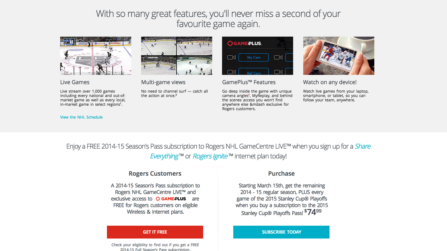
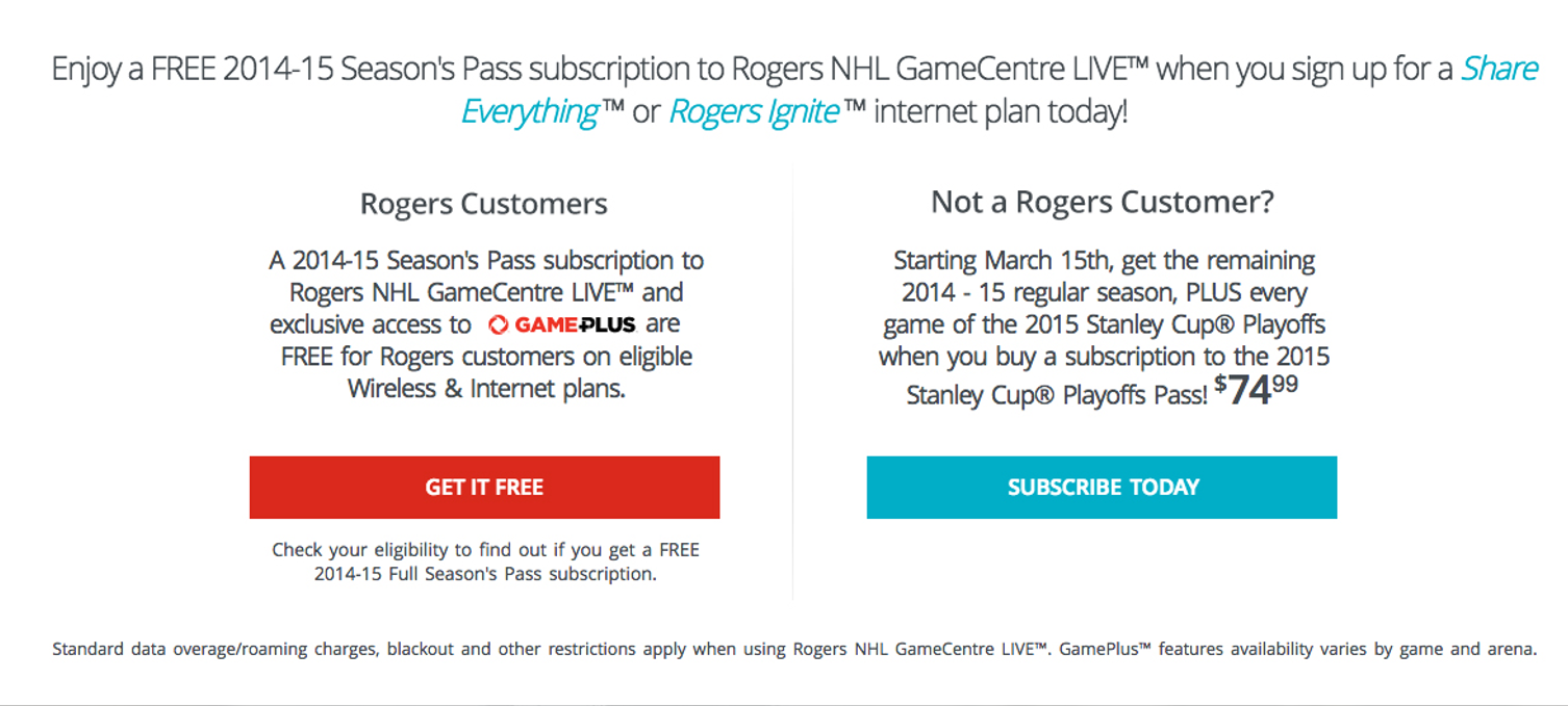
- These call-to-actions have been split into two sections; Rogers and Non-Rogers customers. We addressed some of these issues by splitting the pricing options into two sections: Rogers Customers and Non-Rogers Customers. Splitting them up into two options helps guide users to either check if they get it for free if they’re Rogers customers, or purchase it if they’re not a Rogers customer. The French package option was also removed.
- The language of the first option is now easier for users to understand. There is no mention of eligible plans and we’re suggesting they check their eligibility to find out. We’ve also removed any mention of ‘Share Everything’ or other plans, and we’ve updated all of the copy and now encourage Rogers customers to check their eligibility.
PROBLEM #3: Once eligibility has been checked, users assume that an additional charge has been added to their account.
Here’s a video of a user who’s signed up as an eligible Rogers customer and is worried if their account has just been charged when it shouldn’t have.
BEFORE
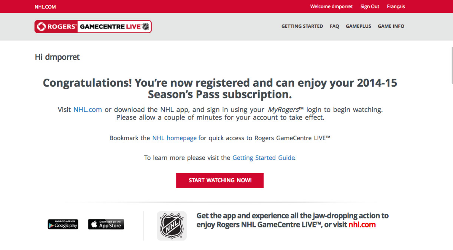
- Users assume that an additional charge has been added to their account because there’s no mention of it being FREE for eligible users. As you can see, there’s no mention of it being FREE. Users can easily get alarmed from this page.
AFTER
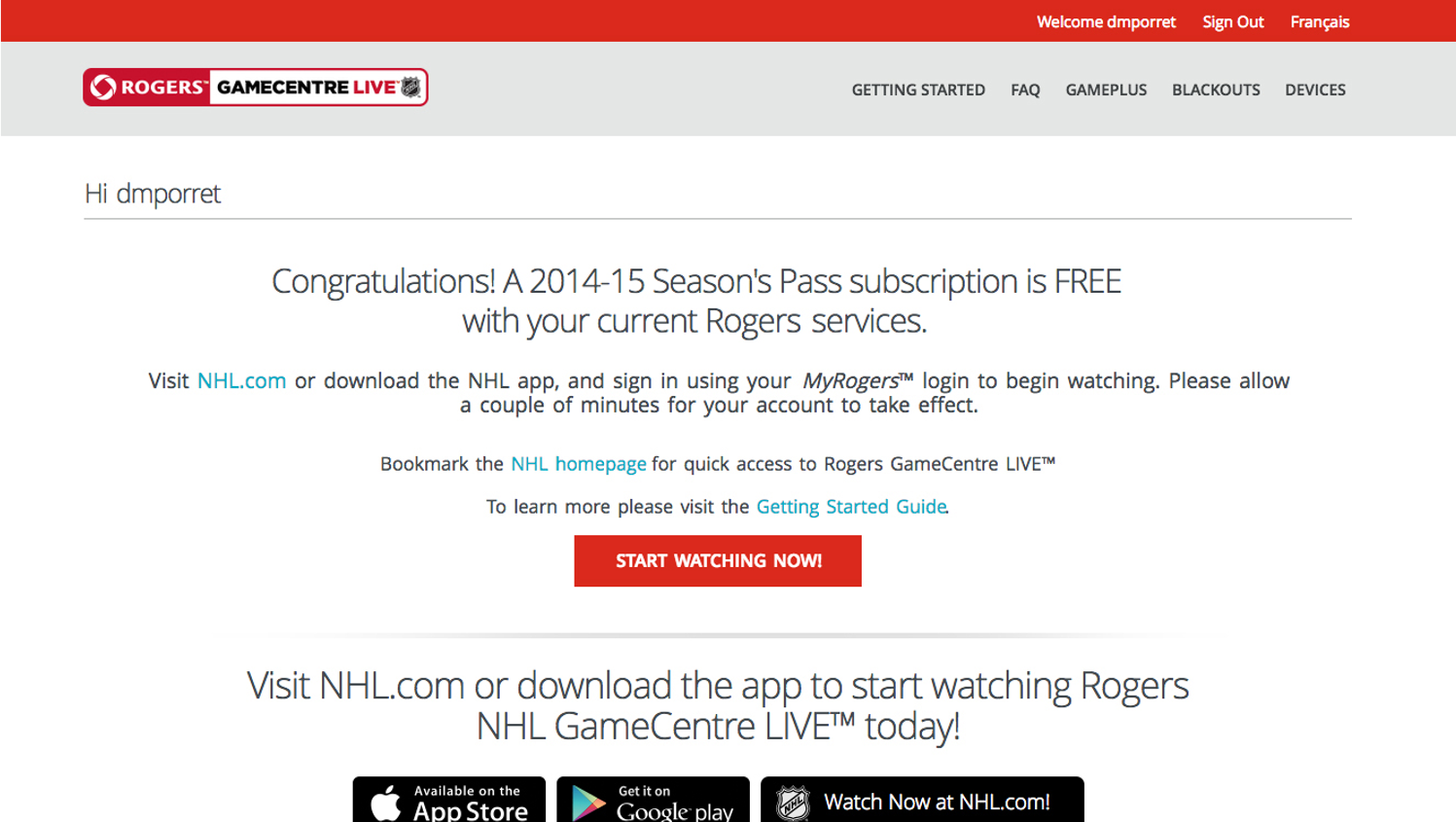
- ‘FREE’ has been added to the copy of the messaging for eligible customers. A quick win in our books was to change the messaging for each scenario. In this case, we’ve added the word FREE and cleaned up the copy in general to make it more straightforward to users.
MORE ITERATIONS AND IMPROVEMENT (Version #3+)
Once iteration #1 and #2 of the Rogers NHL GameCentre LIVE portal were released, version #3 was in the works. Learnings taken from version #1 were applied to #2, and the same pattern would form from version #2 to #3 through user testing and research. Below is a quick snapshot of what the 3rd iteration looks like, but I will cover this in a subsequent case study.


