ROGERS RADIO APPS
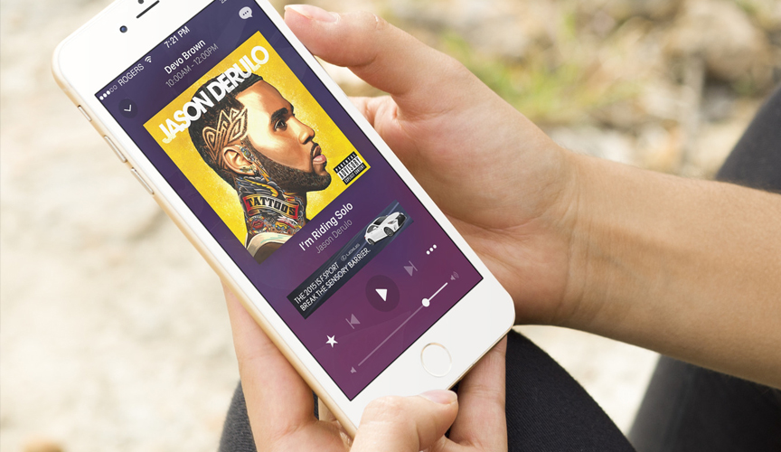
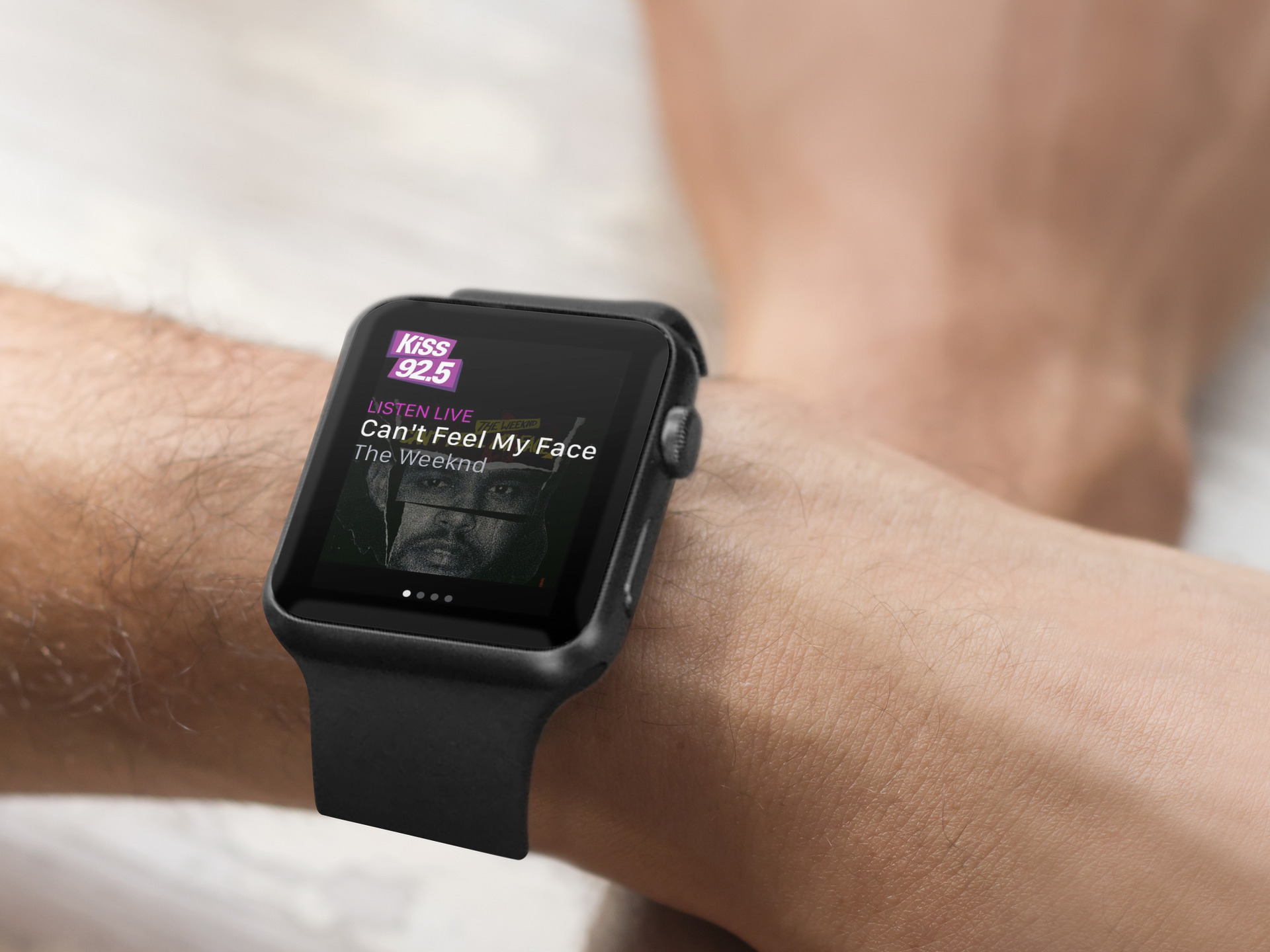
I was responsible for the design of all of the Rogers Radio apps. In total, there were 43 radio stations that needed their own identity and presence in the app store. My approach here was to design and build out a template that could be managed by each radio station post-launch in a CMS. Everything from the colours of the interface and fonts, to the content and logistics of the app were all manageable from the CMS.
MY ROLE
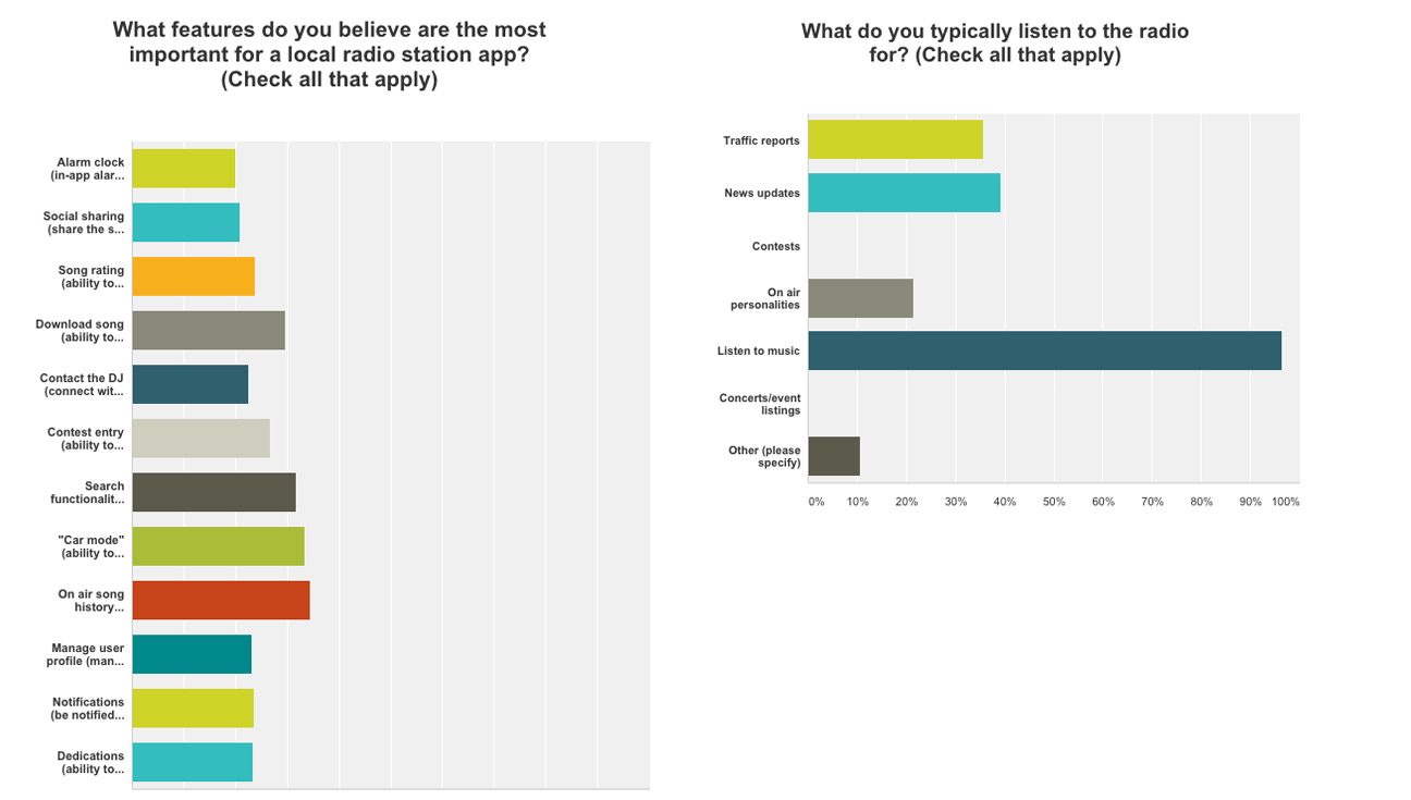
My role on this project was to lead the UI/UX design. I brainstormed, conceptualized and prototyped concepts until we were happy with the approach before proceeding onto any hi-fidelity design mocks. I also conducted user surveys to understand the general behaviour of our radio users.
THE PROBLEM
Not so much of problem, but what the business was trying to achieve here was to create an identity for each of the 43 different radio stations. We needed a space for the brand, DJ’s from their respective stations, and advertisers to tell their story. So essentially, it was a marketing push, as well as a push to create additional revenue for the business through ad sales.
THE CHALLENGES
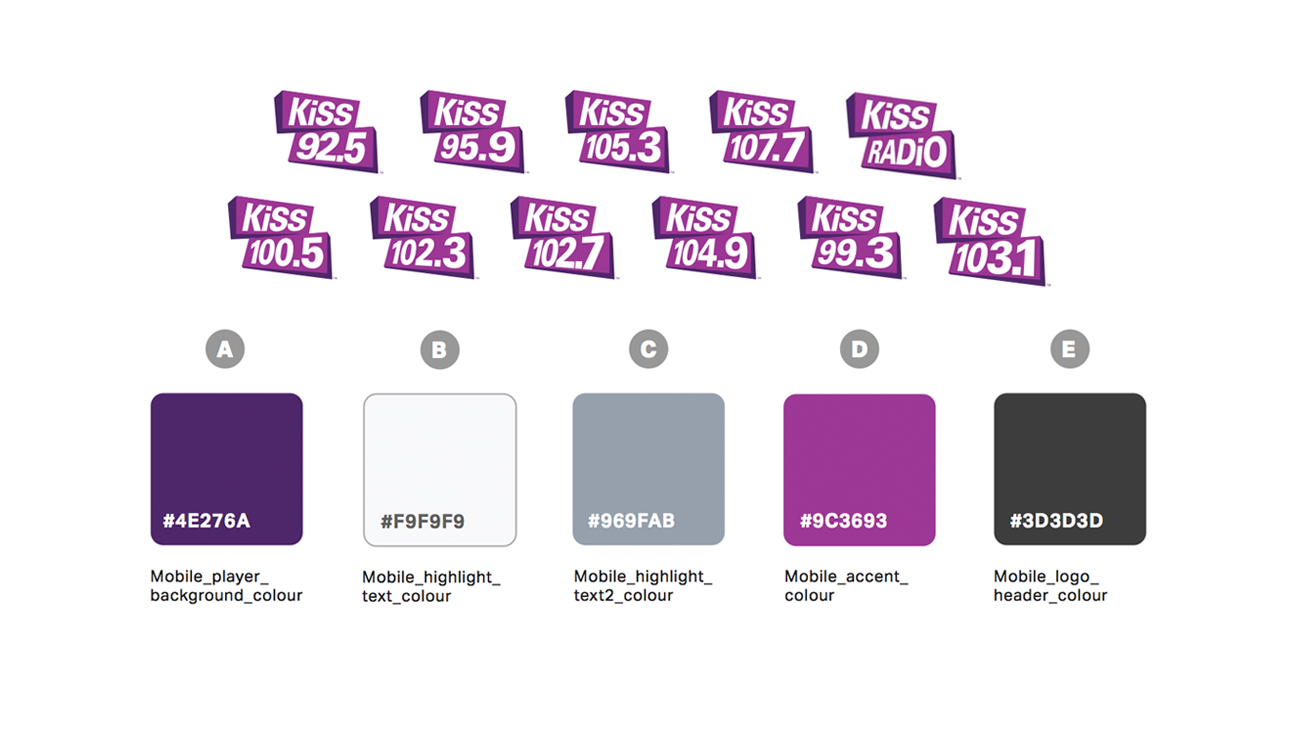
This project was very different from other app projects that I had previously worked on. Building out an app template for 43 different brands naturally has some challenges. One of the biggest things was communicate with each and every brand on ensuring brand colours were correct and up to date, and educating them on how their app would look. Another challenge on this project was trying to find a solution that would act as a ‘middle-ground’ for 43 different apps – it needed to work for every app, considering they all were different in their own way. Lastly, submitting 43 apps all at once presented it’s own issues; for example: app store submission wasn’t a breeze to say the least. Imagine providing app icons and screenshots for both iOS and Android, for 43 different apps?
DESIGN PROCESS
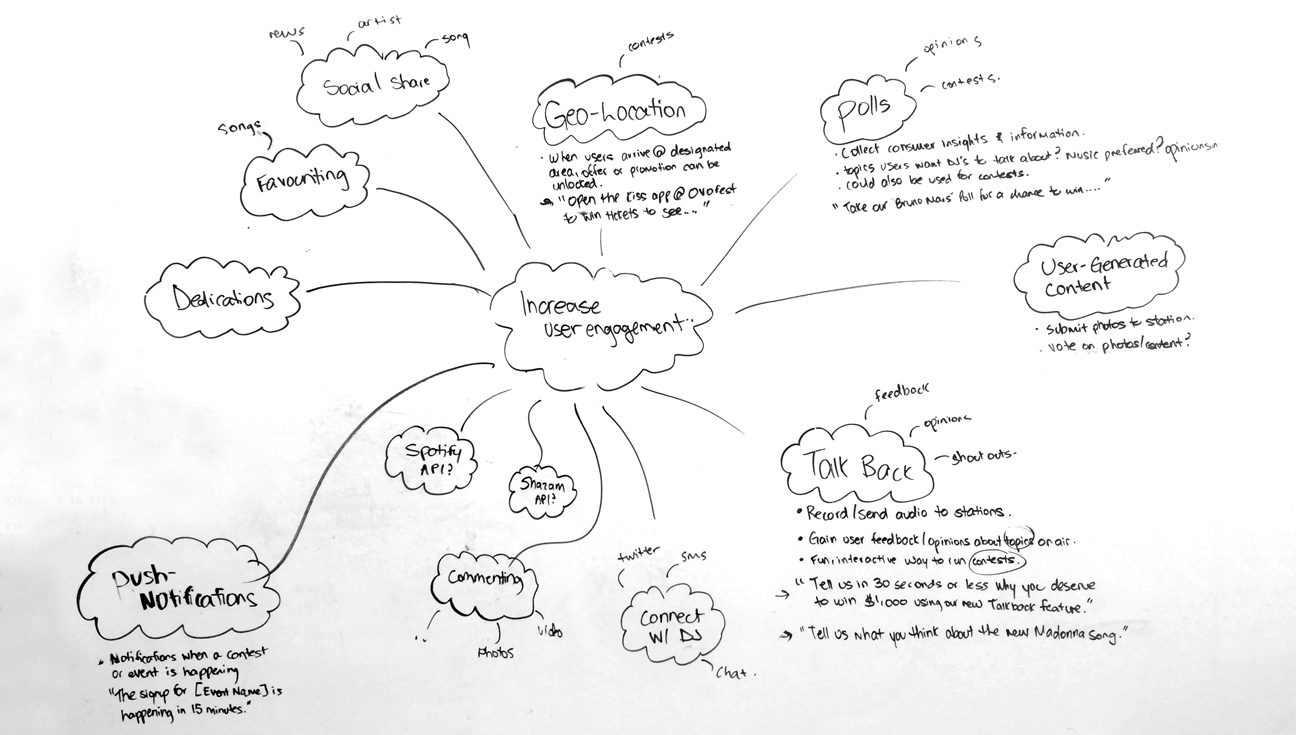
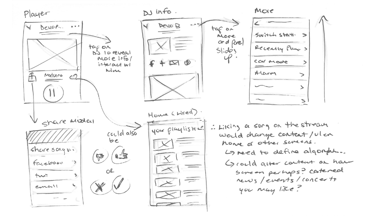
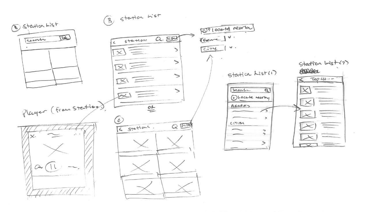
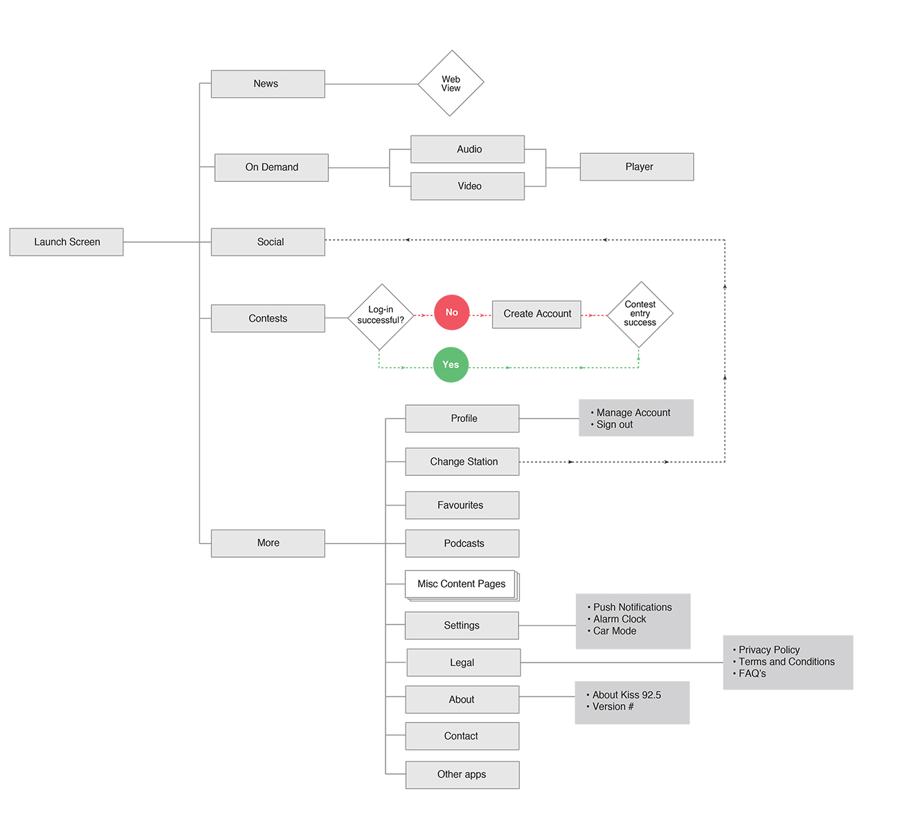
Throughout the initial stages of this project, I took part in conducting user research – testing and user surveys to gain insight on how users were using the existing apps and what features were important to our audience. Once there was enough insight gathered to form an approach, I began by sketching, brainstorming, wireframing, building out flowcharts, mind maps, and everything needed to communicate some of my ideas and vision for these series of apps.
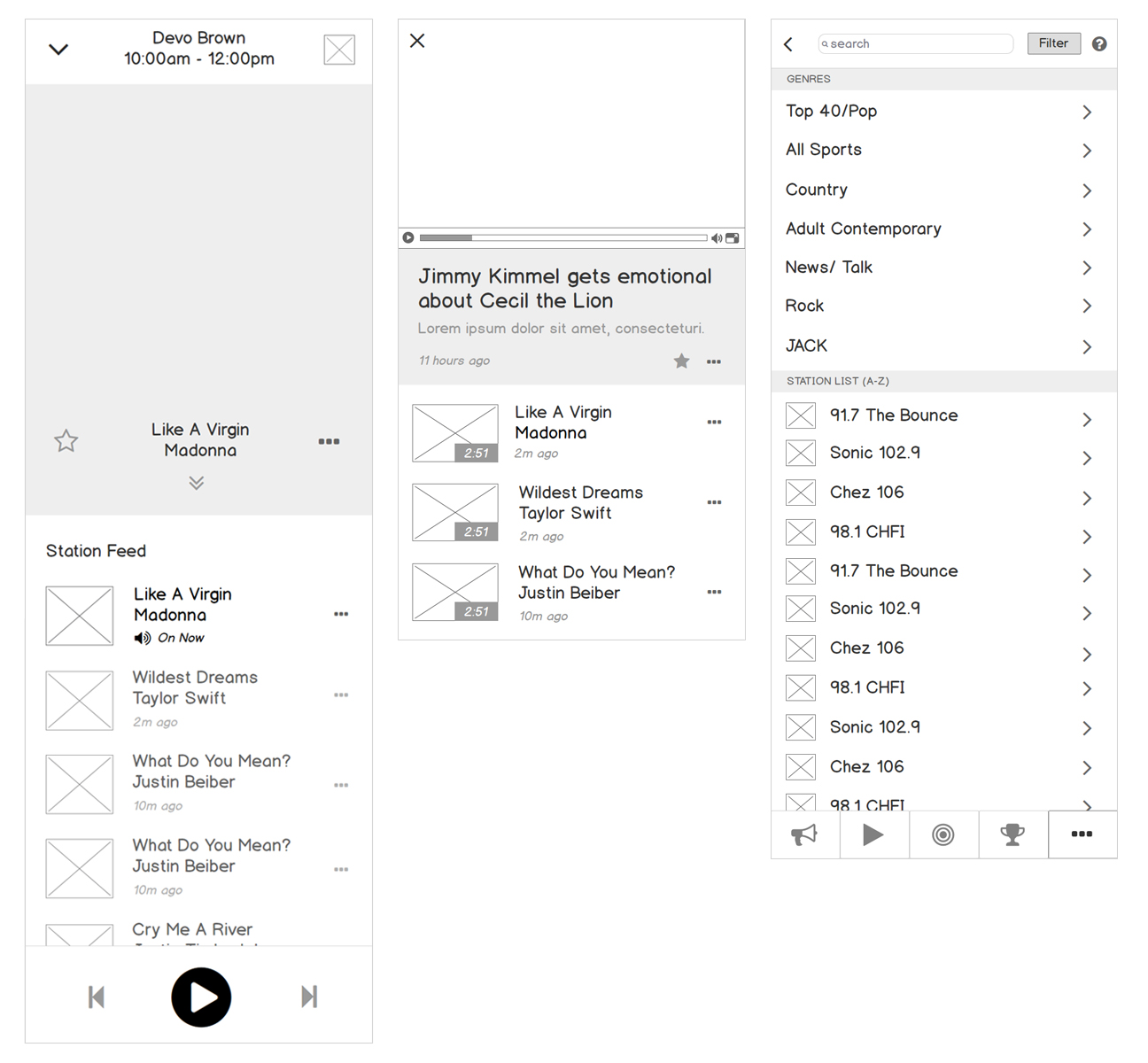
TEST, PROTOTYPE… AND TEST SOME MORE.
After my initial sketches were approved and we moved forward with a solution, I moved to designing and prototyping. The idea was to show developers and stakeholders my thought process in terms of the interaction, transitions, and specific details that the app would have. In addition, prototyping allowed us to test our assumptions and to ensure everything made sense.
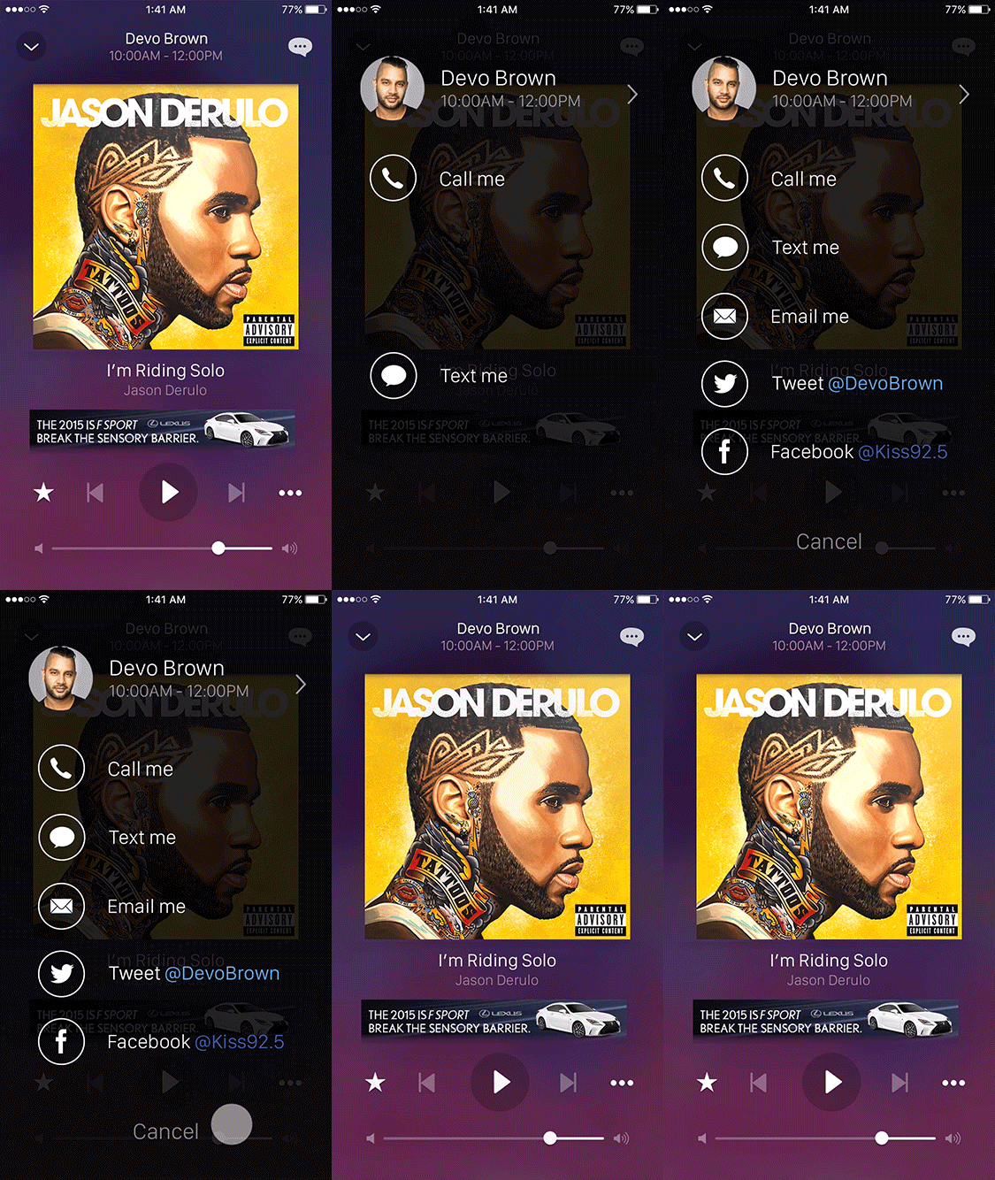
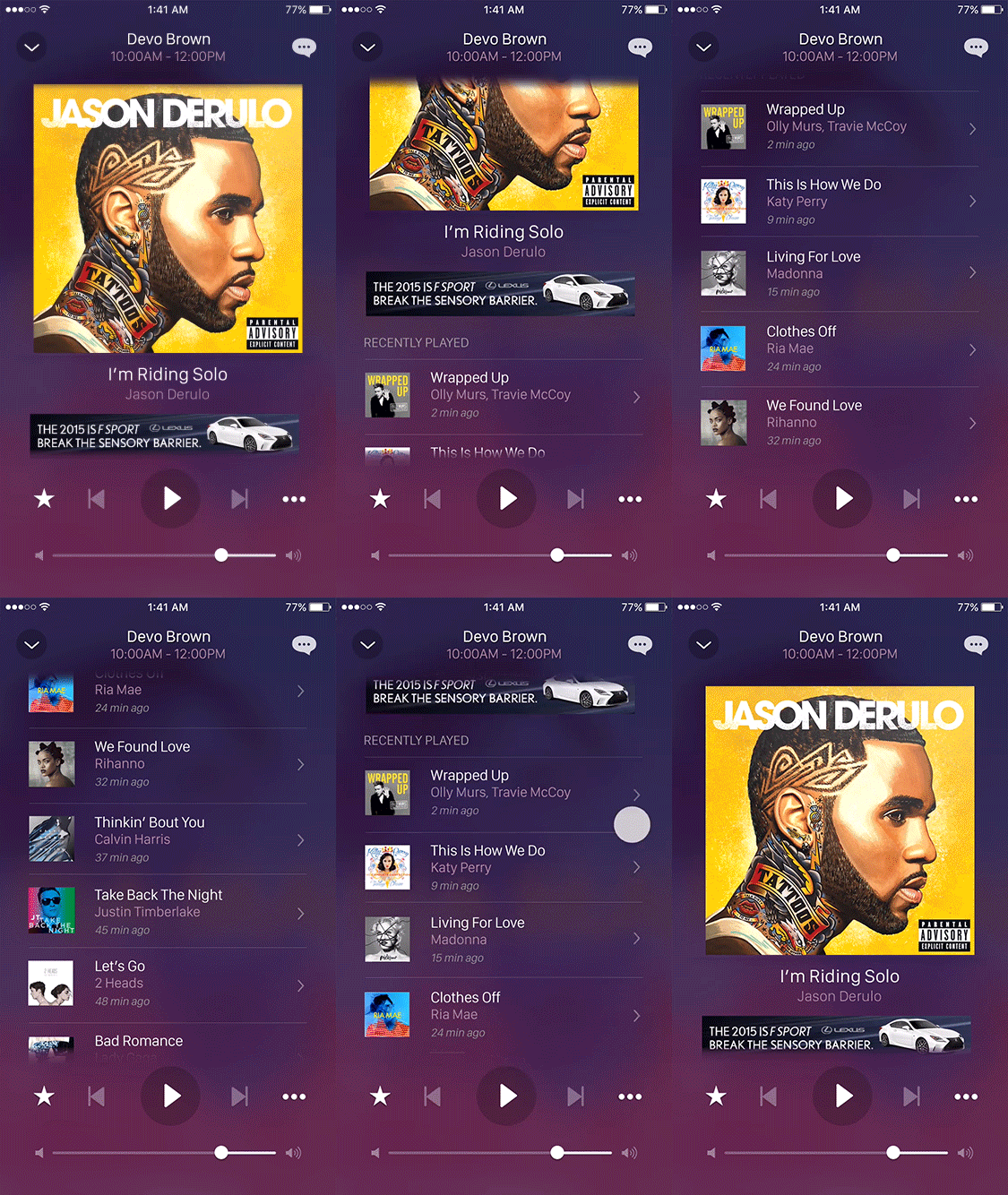
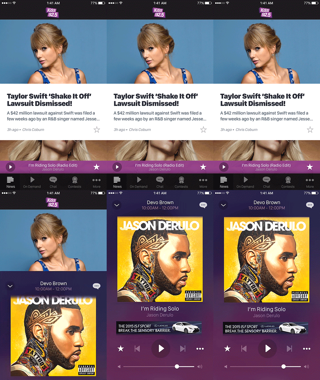
HI-FIDELITY DESIGN
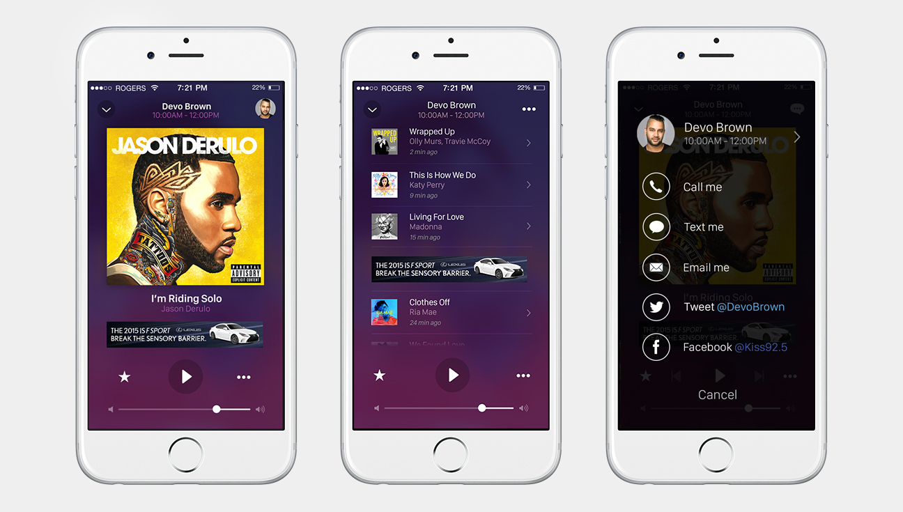
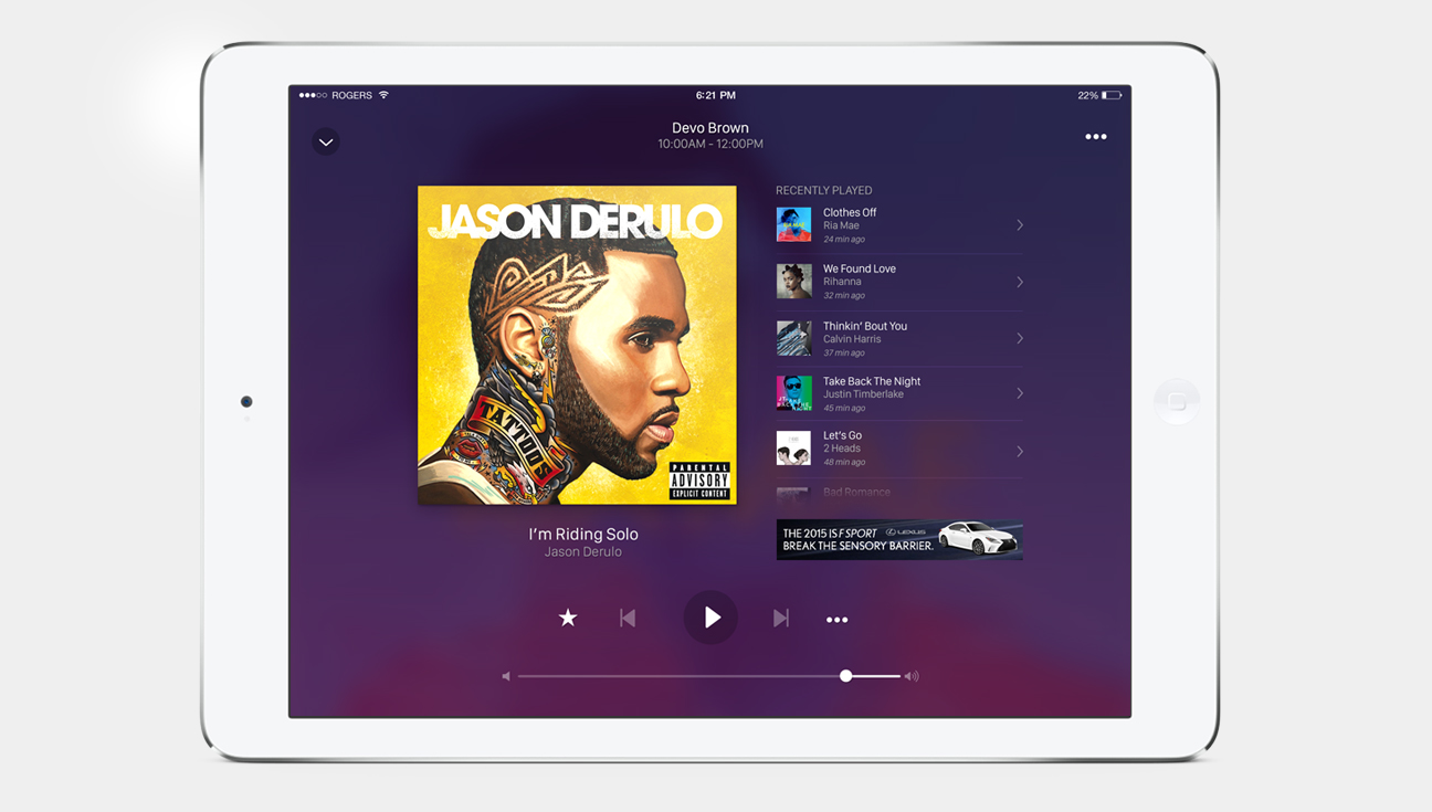
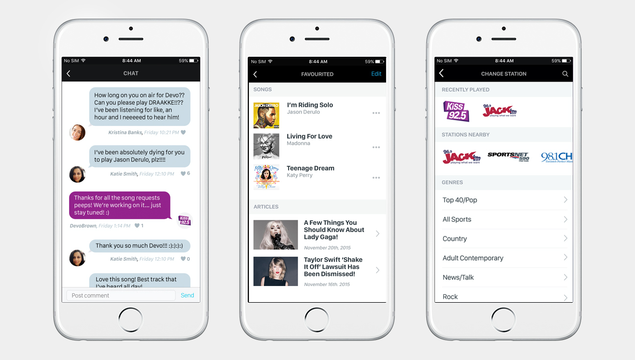
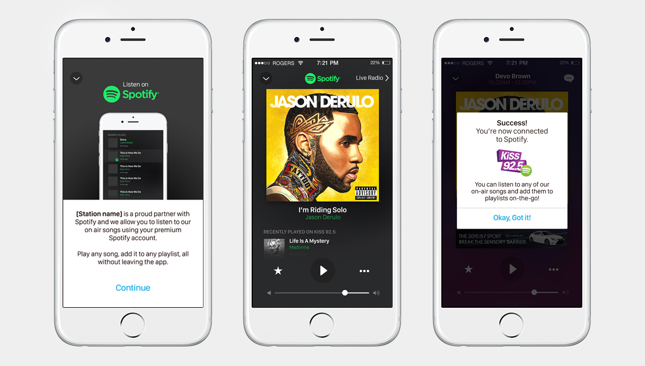
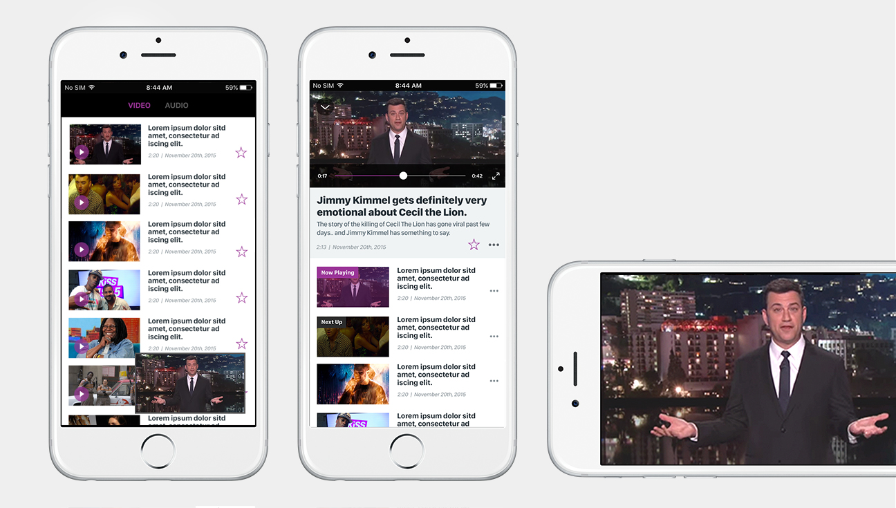
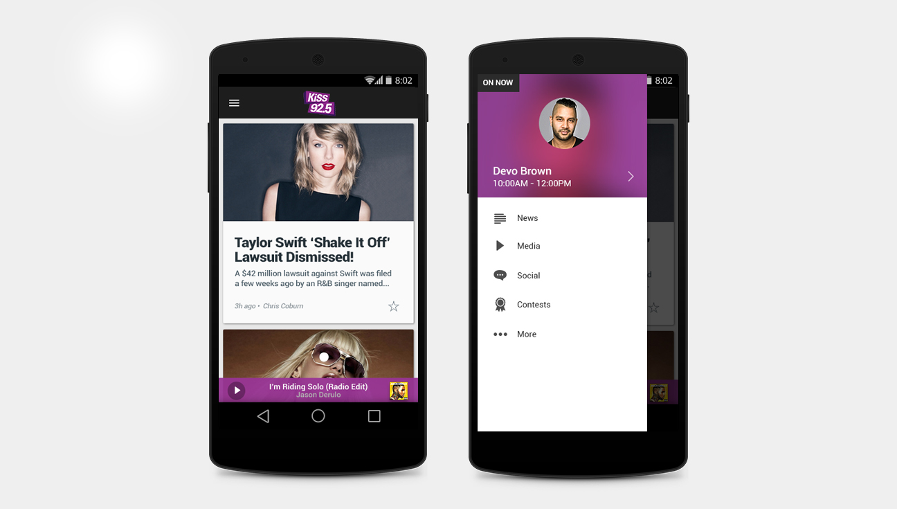
Once prototypes and concepts were approved, I moved to hi-fidelity design mocks. I fine-tuned various aspects of the design, got approvals, and eventually built out assets for the developers to use for both iOS and Android devices.
POST-LAUNCH REACTION
This app was received well amongst the company and ended up winning the Business Impact Award which is awarded to teams and projects that affect and impact Rogers throughout the year.


