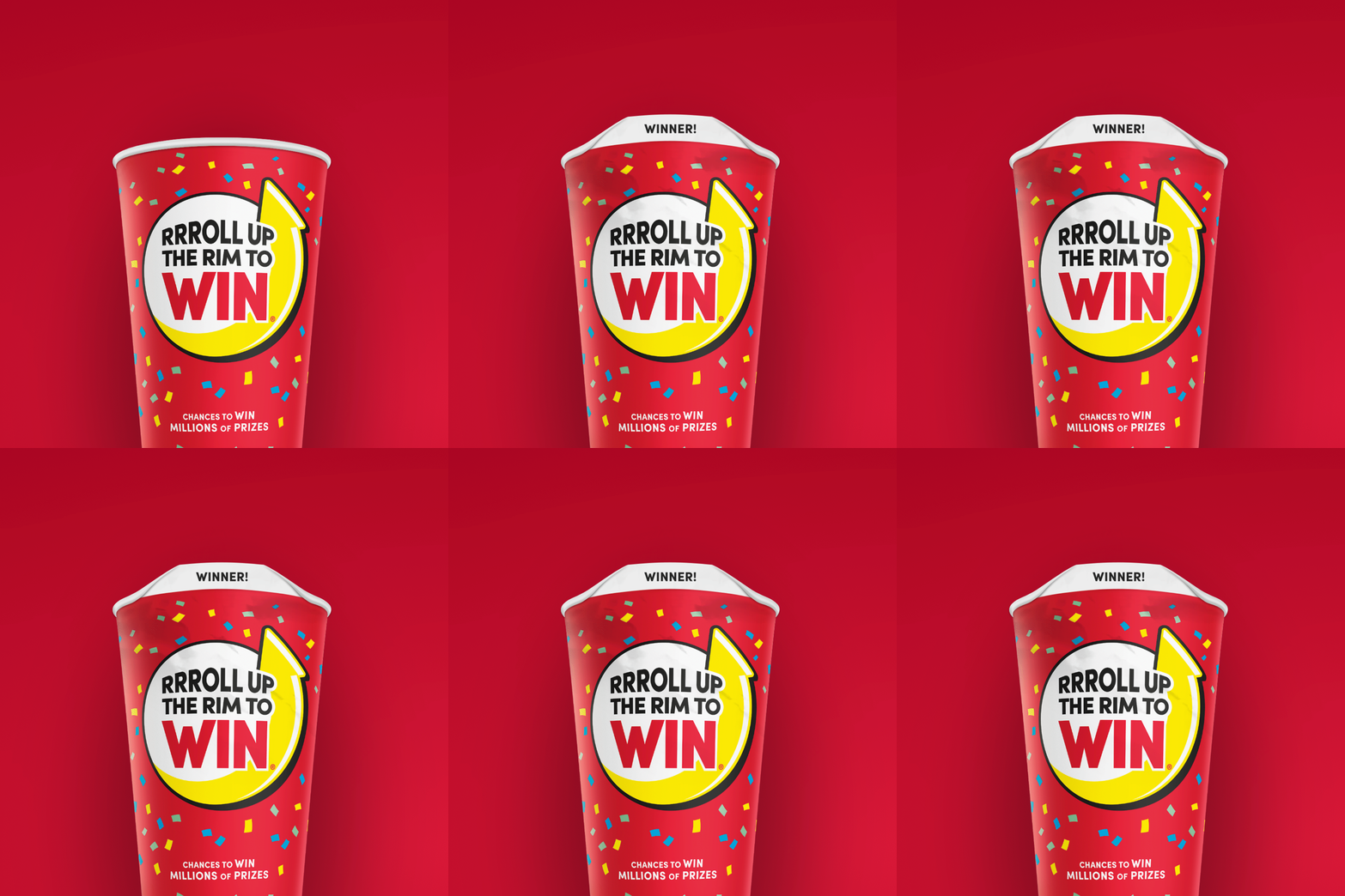
Tim Hortons – Roll Up the Rim
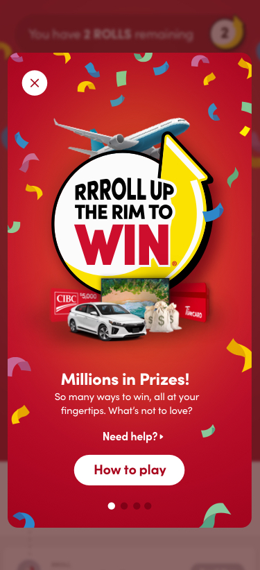
Tim Hortons was looking to revamp their Roll Up the Rim campaign by going digital and wanted to make it exciting again. The ask was to define an experience and develop a game engine for this campaign as well as future years. The goal of this project was to drive adoption of their Rewards loyalty program (which we and team designed and built previously) and therefore build on their digital transformation momentum.
As the lead product designer on this project, my role on this project was strategy and product design. I worked closely and collaborated with cross-functional teams including brand, marketing, product owners, project managers, legal and developers alike.
I have created all digital roll up the rim campaigns to-date. The first game launched in March 2020, and we’ve run the game a total of two more times since then. We gathered feedback from real users, iterated on and improved the game after each year. This project served as a template that would be leveraged for future Roll up the Rim campaigns.
The Problem
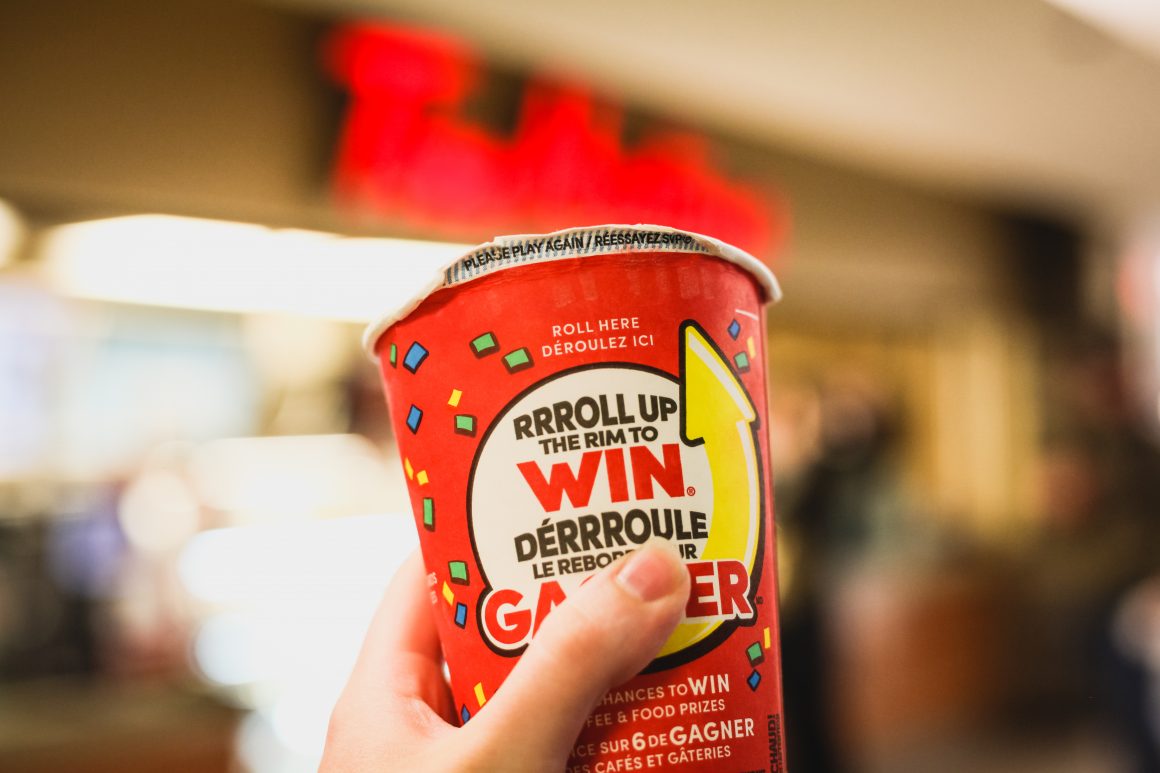
The problem that this game was solving was that traditionally, this game was played with physical cups where customers would purchase coffee in the restaurant, scan their physical Tims Rewards card, physically roll up the rim of their coffee cup they just purchased and then finally, redeem it in store to see if they’ve won. This 33-year old process was dated, tedious, cost Tim Hortons a pretty penny and many times, ended up with coffee cups just being thrown out on the sidewalk.
If Tim Hortons could solve this problem through their digital transformation, it would mean less money spent on wasted coffee cups and less garbage thrown out their window and on our streets. This program would support the push of Tims Rewards loyalty program introduced and would therefore be another strategic move to enable adoption of the digital transformation with their customers.
“We’re not going to kill the game, we just need to make it more exciting again. You’re going to be able to play it on your phone next year when we go digital, no doubt. It’ll be part of a really cool app, I promise you that.” – Ron Buist, Head of Marketing, RBI.
What would success look like?
Success would mean completely revitalizing and overhauling the experience and going all-digital to make it exciting again, drive adoption to the new loyalty program and to get more customers coming back to the restaurant, buying products and scanning their Tims Rewards cards with their phones. Digital transformation and adoption of the loyalty program was the programs target.
What metrics were we focused on?
The primary KPI’s we were targeting were ones centered around the adoption of the digital transformation and the loyalty program ie: app sessions, active users, order completion and daily transactions from Tims Rewards users. Adoption and user affinity to the game were also key, so we strived to increase app downloads, registrations and review ratings in the app store/play store.
Challenges
How would we go about working through this digital transformation. Where would we even start? What key things should we focus on? I mean, how do you even create an experience that is addicting, exciting and feels like the real thing?
Aside from the challenges of creating an all-digital experience and template that wouldn’t didn’t take away from how it was played in the past, there were the usual challenges of working with multidisciplinary teams and departments, notably marketing, brand, legal and even the franchises themselves who all have their own set of processes.
Another unplanned challenge for the first version of this game, was the fact that a couple of weeks before launch, COVID-19 hit and therefore, Tim Hortons was forced to pull the physical cups from the game... That’s 1.8 million cups physical cups that were created and all scrapped and thrown out. Initially, the plan was to run both physical cups that can be purchased from the restaurant, and the digital roll up campaign that we were running. The plan was changed at the very last minute and we went fully digital and caused a lot of rework, just days before the launch of the game.
Solution Approach
The end game here was to create an experience that would commemorate a 33-year old program while evolving for future generations. We would need to mimic and improve the experience by going digital. These efforts would in turn allow for an increase in sales, the new loyalty program digital transformation and app usage.
An experience centered around feel
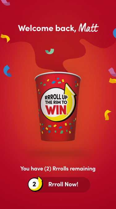
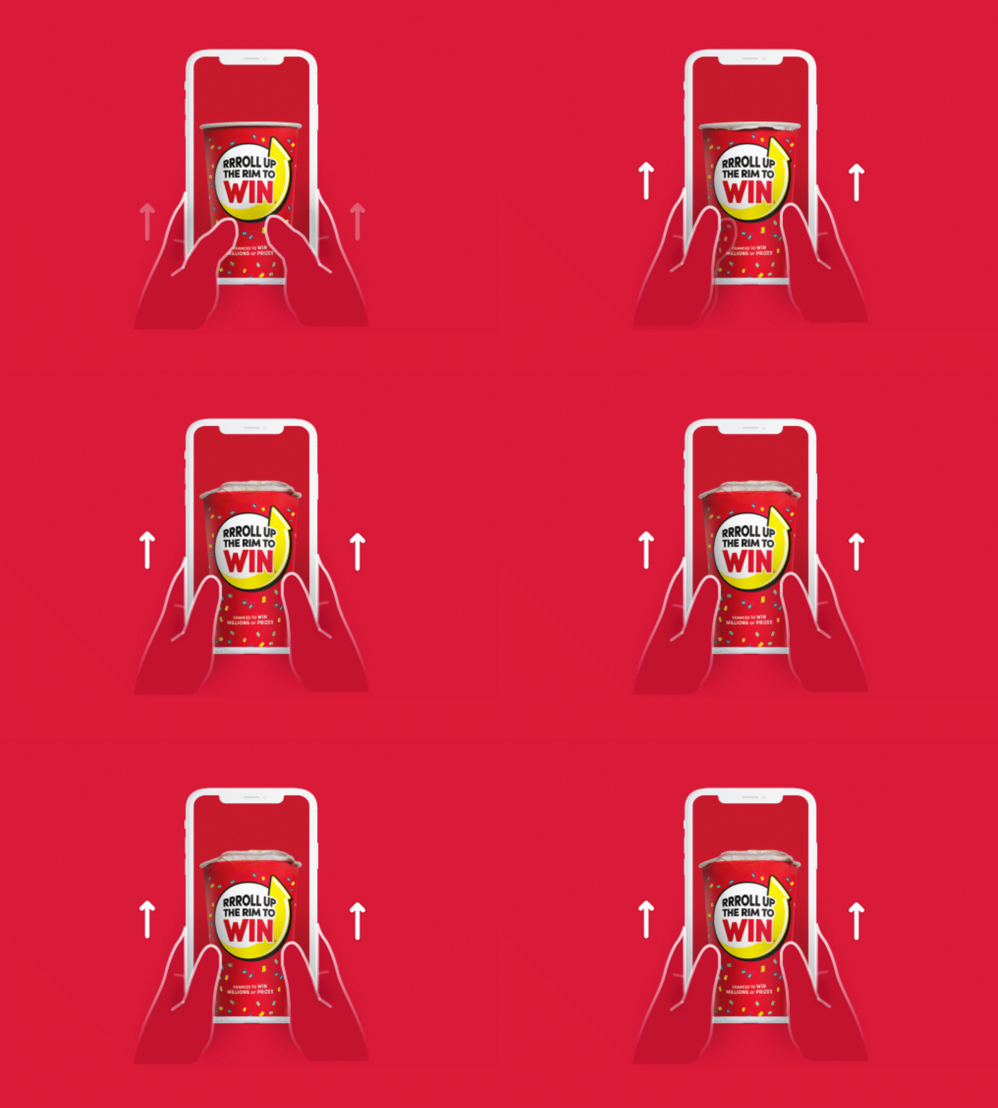
A majority of our experience focused on creating a natural and intuitive rolling experience, similar to that of actually rolling up a physical cup. But… how do you create an experience that isn’t actually rolling up a cup, but feels like the real thing? If we didn’t execute well, it just wouldn’t look right and would hinder the experience. It was literally the biggest test of skeuomorphism I could think of. So… we spent quite some time working through the kinks and making sure that it was executed well.
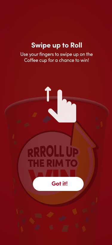
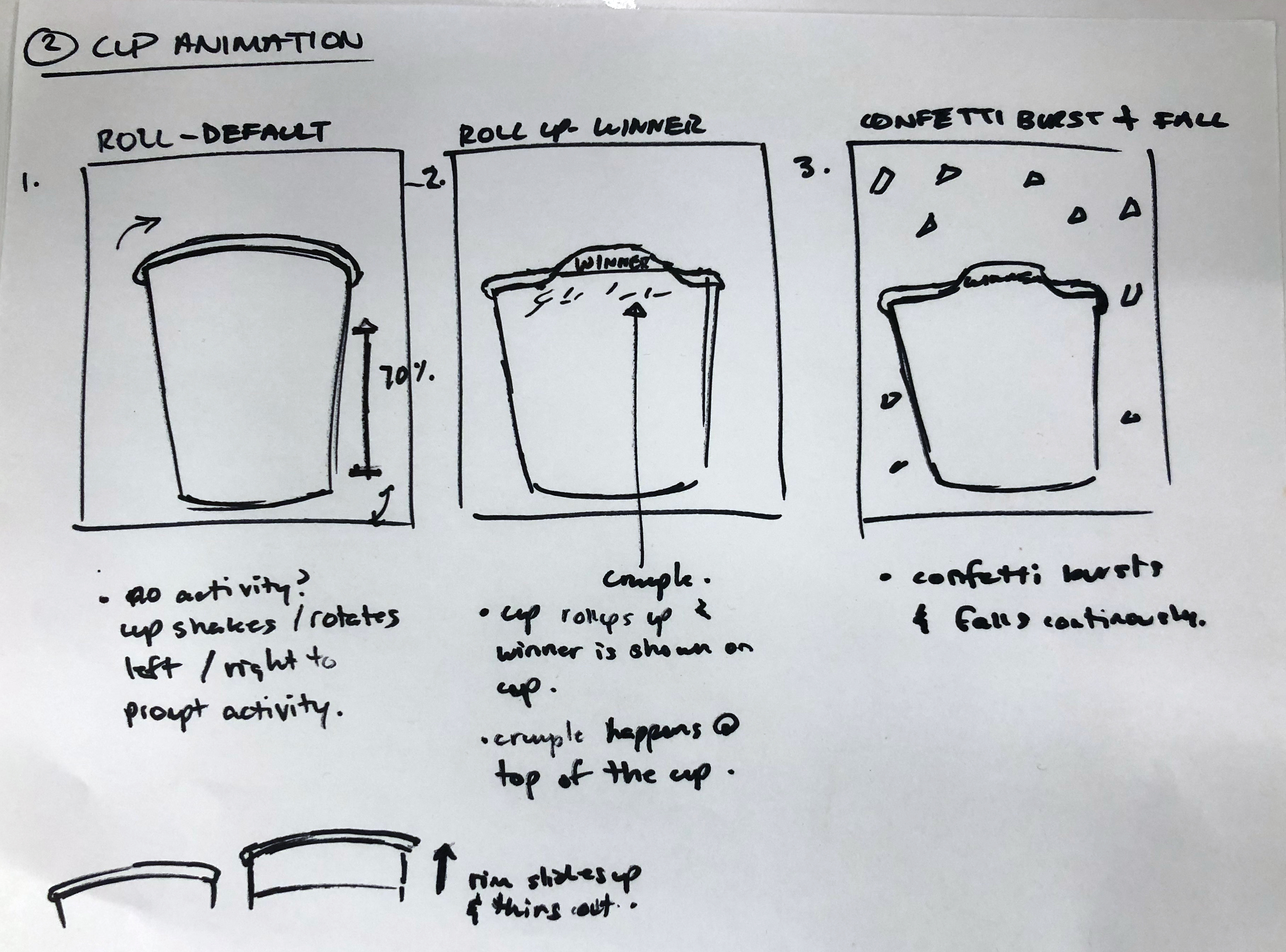
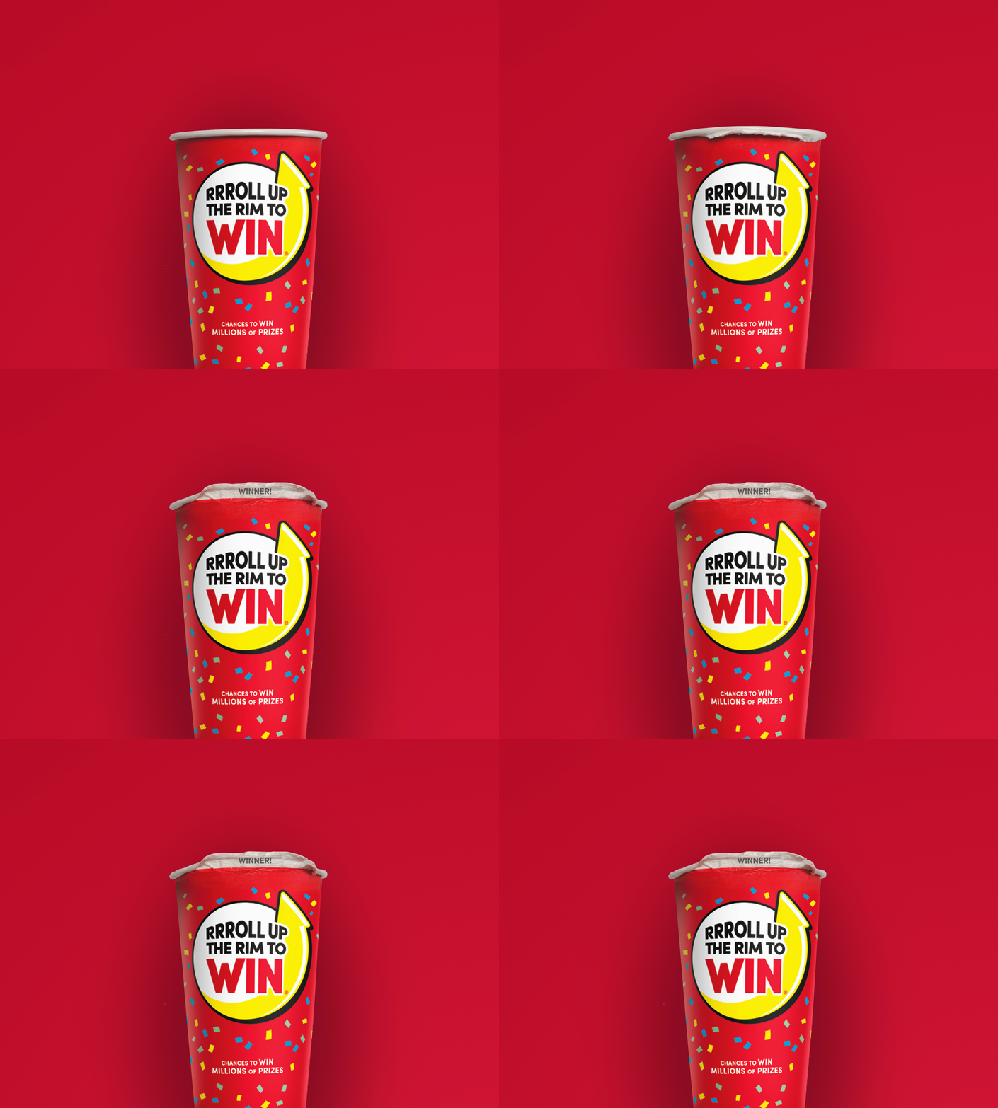
I tried so many different methods to try and make the experience of rolling up the cup feel intuitive. I tried stop frame animation which didn’t work out well and looked more like something out of a Tim Burton film. In the end, we settled on a digital-looking version that worked well with the rest of the app. Users would swipe up to roll and once complete, we would play a delightful sound for them and hit them with some confetti to let them know they’ve won.
An addictive gaming experience.
There was an emphasis on micro-animations within the application to make it feel alive and engaging. You know when you’re at a casino and you sit down to play a fun and flashy slot machine? That element of excitement and engagement? That’s what this game needed and it’s what we strived for in this experience.
Creating an experience that was interactive and flashy would prove to tie into the goal of creating something that was addictive and could stack up against what our competitors were doing. It needed to be cutting-edge, it needed to spark excitement and delight with end users and in the end, it needed to feel like a game that our users would want in their hands and would want to play.
A catered and personalized game.
This experience needed an inviting space that users could keep coming back to for the duration of the campaign. In order to achieve this, there would need to be aspects of the game that would draw users in and entice them to keep playing. We achieved this by creating an experience that was catered to them, an experience that was personalized and an experience that was empathic, understood its customers and delighted them by offering up a personalized experience that spoke to them.
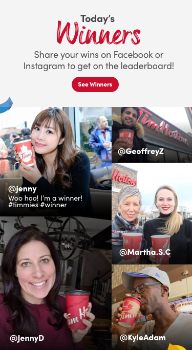
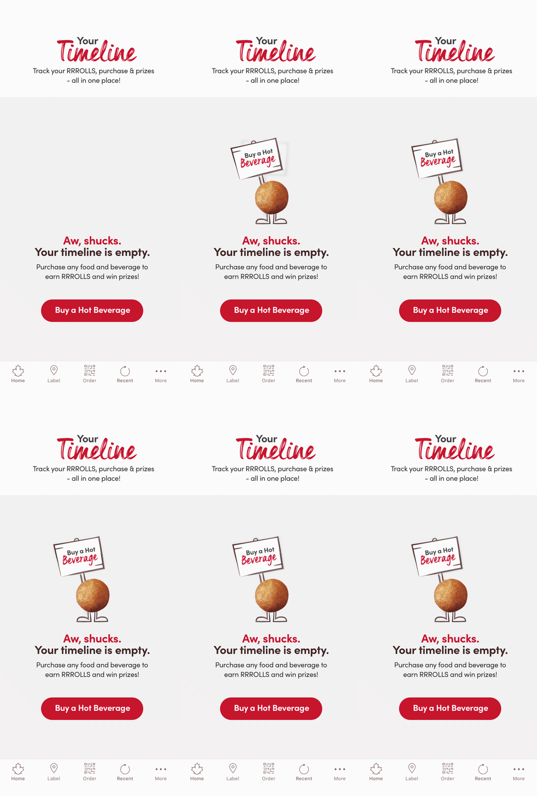
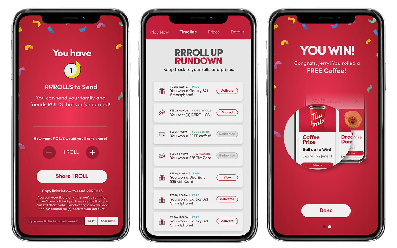
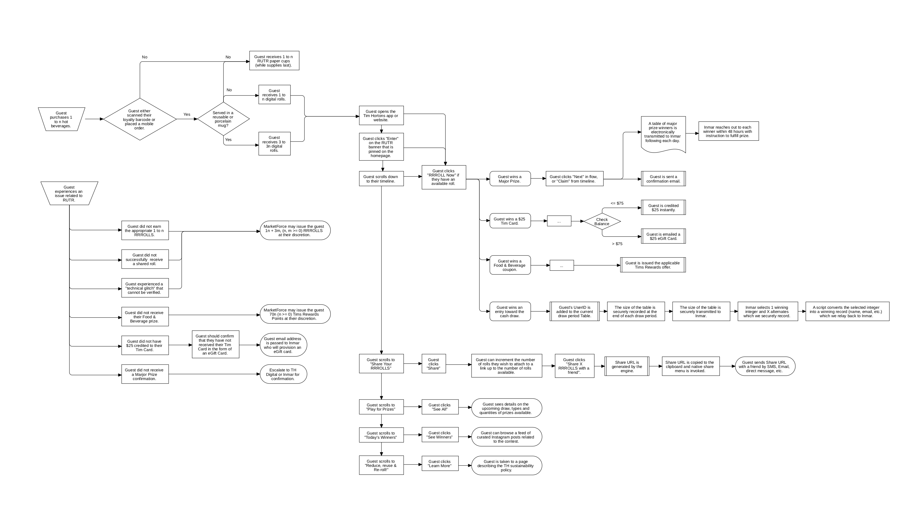
We created a timeline which would track your rolls, tell you what you’ve won, and allow you to claim prizes if you haven’t already done so. We played with adding social elements like ‘share your win’ which would be shown on the dashboard of this experience. We even toyed with giving customers the ability to share rolls with their friends to keep engagement levels up.
An experience that listens to its customers.
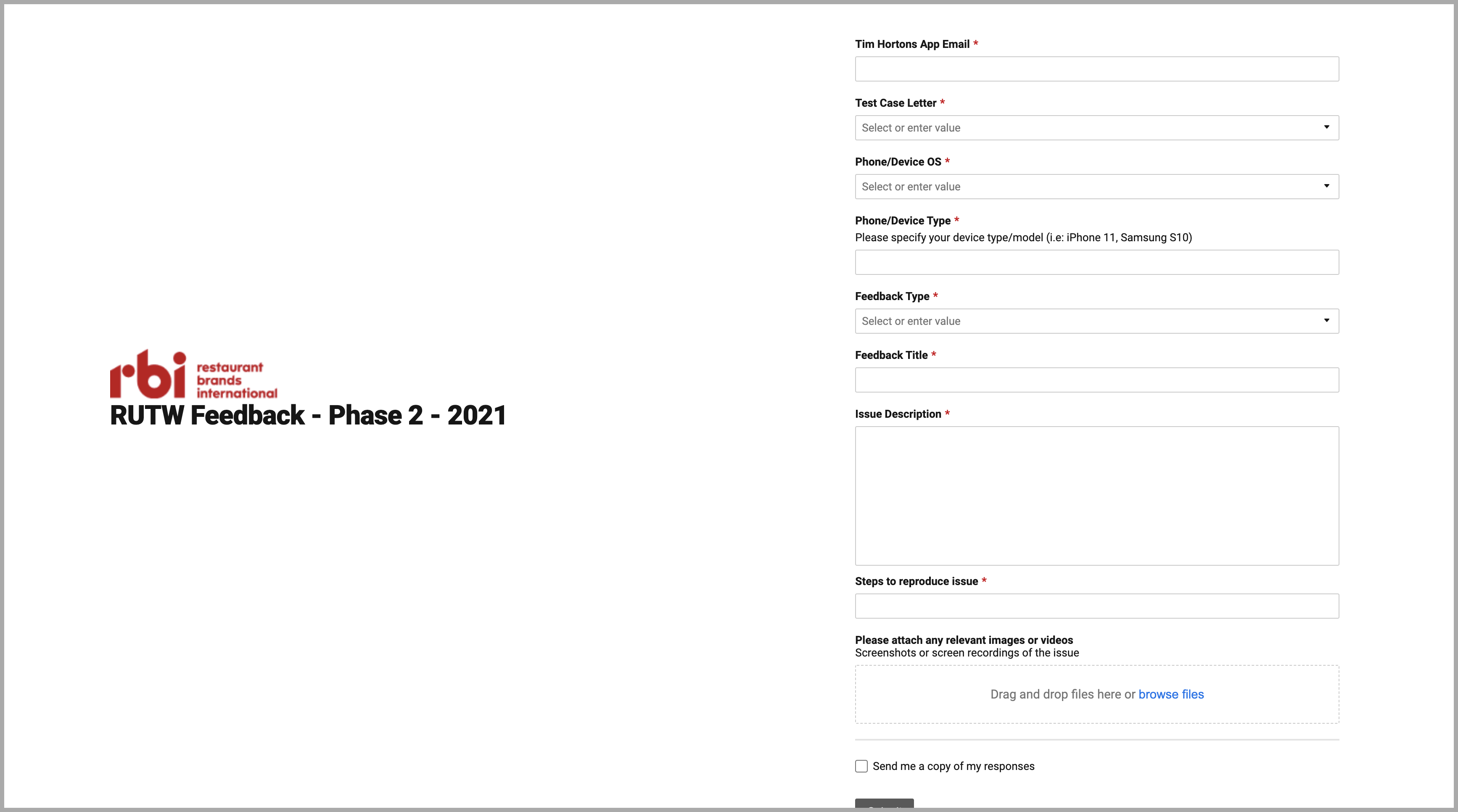
One of the most crucial aspects of delivering a successful digital transformation and game was getting to the heart of the 33-year old game and giving customers exactly what they want. This meant sending out surveys to customers, A/B testing and stress testing the usability and seamlessness of the application through its end users and Tim Hortons employees.
Through beta testing and other means, we were able to treat the initial concepts, prototypes and early build as an experiment that we can iterate on. Once the game was finally launched, the team was as confident as ever on our design and build decisions through the insights collected, but there were still learnings and iterations to be made during the game and the following year.
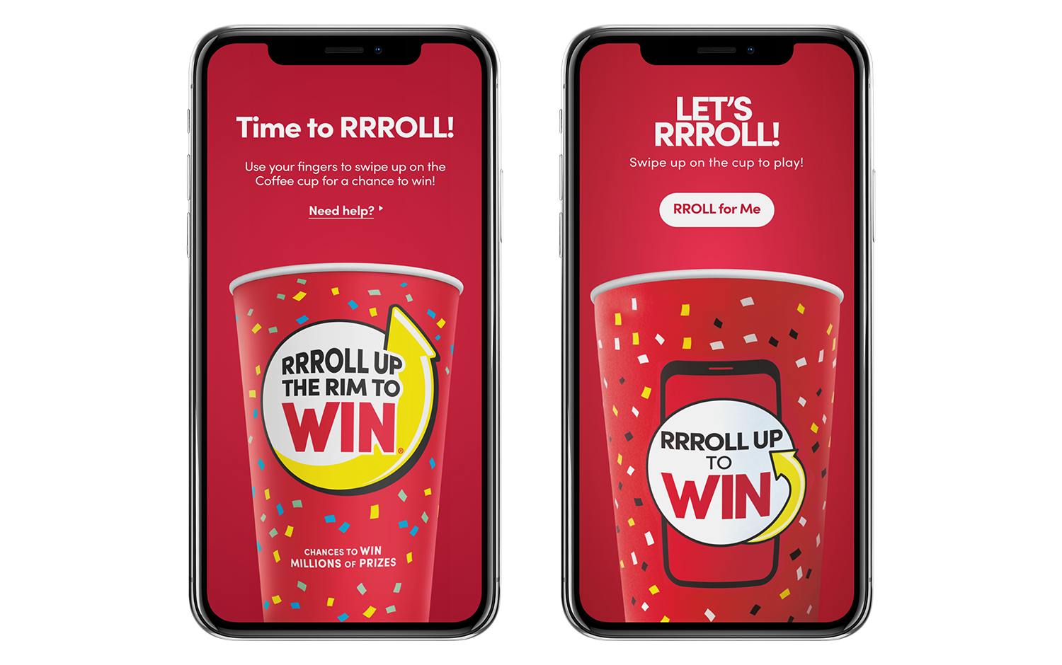 Roll for me button: Customers were complaining about the ease-of-use of the play experience. Swiping up on the cup wasn’t obvious enough for users. Pictured on the left is the first iteration of the game, while the image on the right shows an example of how the experience was improved. The “Roll for me” button addressed both a user pain point and some initial accessibility concerns through testing.
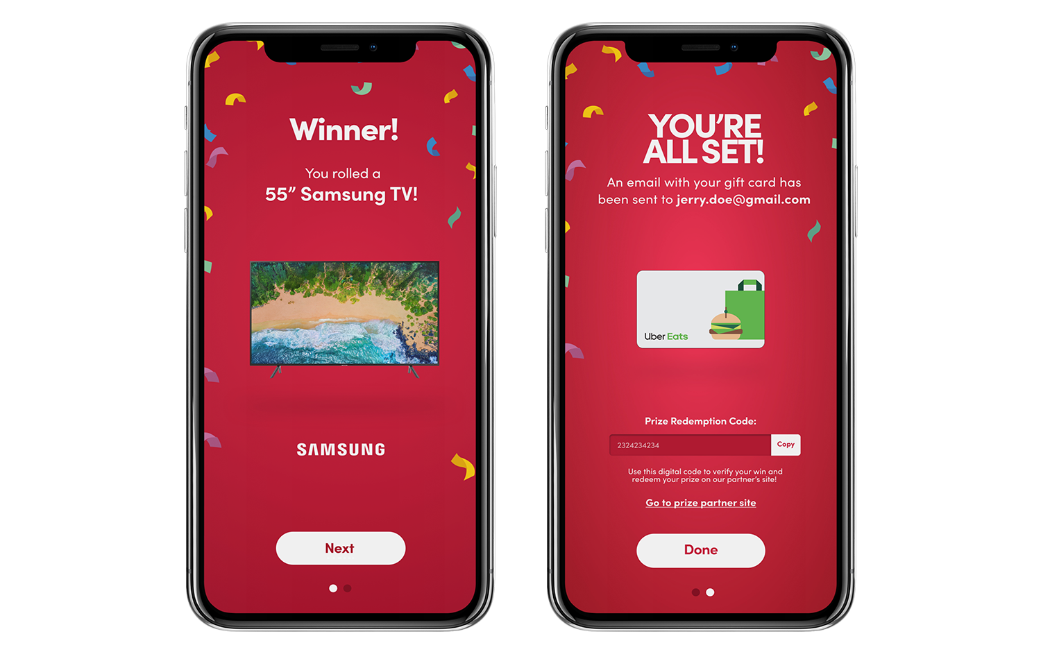 Addition of prize redemption codes: Customers were complaining that they weren’t receiving emails to redeem the prizes they were winning. A prize redemption flow was added to the game experience that would allow them to copy and apply the code at the prize partner website level. In addition to this, emails were still sent out with prize redemption codes, and users would also now have the ability to claim their prize from the timeline on the home screen. (shown below)
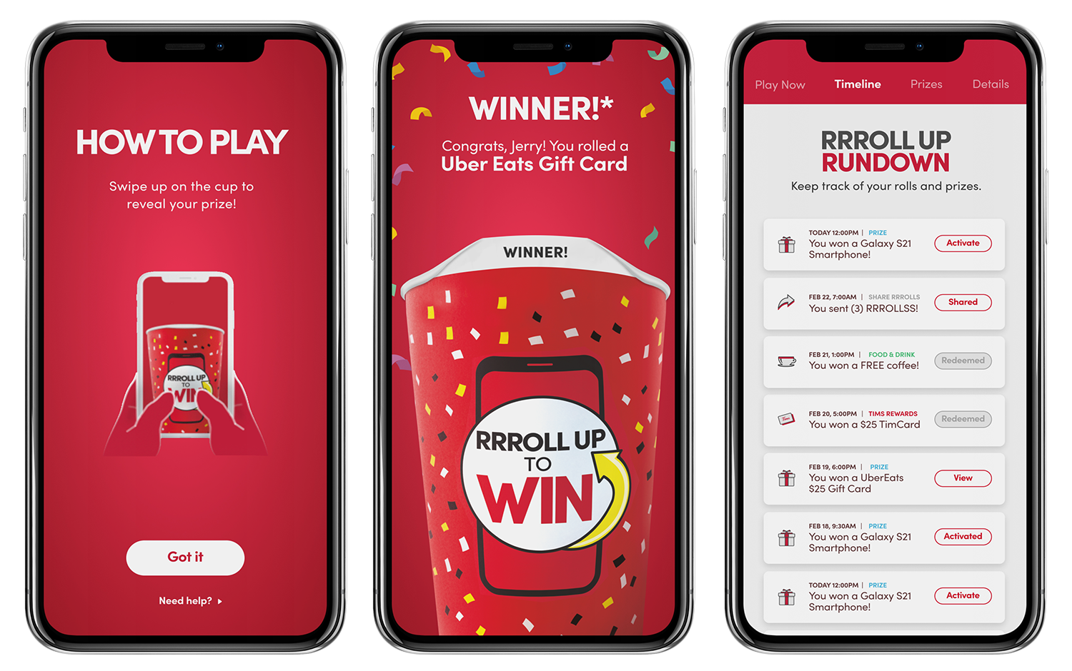 Play experience revamp: Outside of addressing user pain points, the game experience of playing was improved to address usability and experience concerns. Pictured above are a few screens of what the new experience looked like. Improvements such as an animation that shows users how to swipe up to start playing and adjustments to the animation and sound effect that plays once a user rolls were all refined. As mentioned above, improvements were also made to the timeline (history) that is shown to the user that is essentially a receipt of their rolls. Users would now be able to claim their prizes directly from the timeline which was a dramatic improvement from previous games.
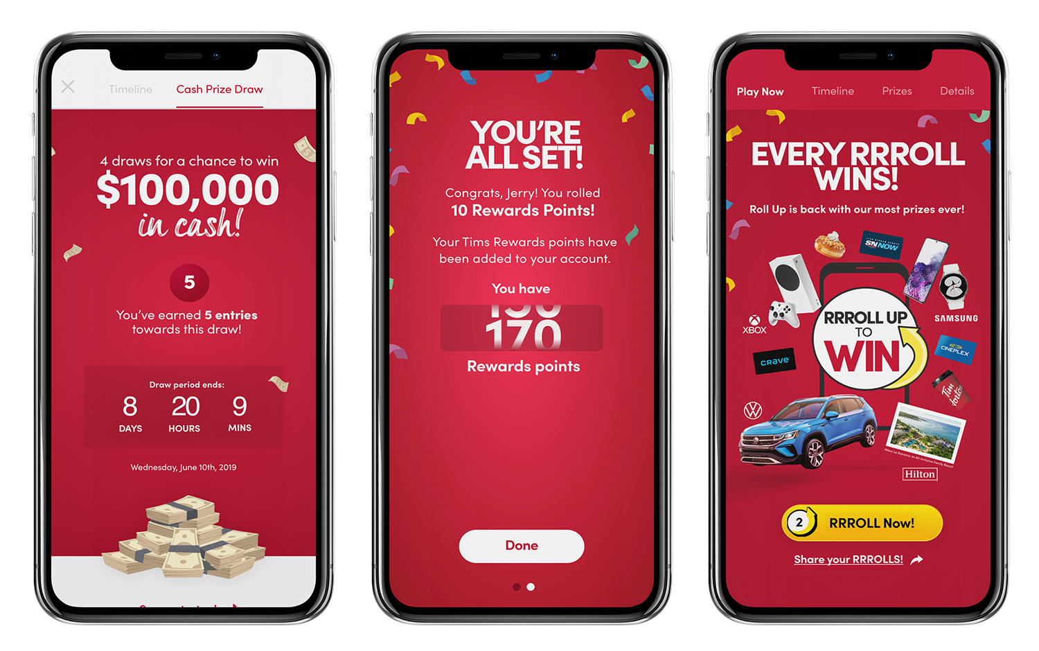 Every roll wins: Traditionally, for customers that didn’t win when they rolled up the rim, they would see a tab titled “Please play again” under the rim of the cup. Pictured left, the first iteration of the digital game had customers enter a cash draw if they “lost” while playing. Customers weren’t too thrilled and engaged with entering a draw. We wanted to incentivize users to keep playing and coming back, so we adjusted the strategy and came out with “Every roll wins”. Pictured in the middle is what would happen when users “lost”. They would win Tims Rewards points in increments of 5, 10 and 15. The benefit was two-fold as it continued to push the digital transformation narrative and back our loyalty program incentive while exciting more users to want to keep playing.
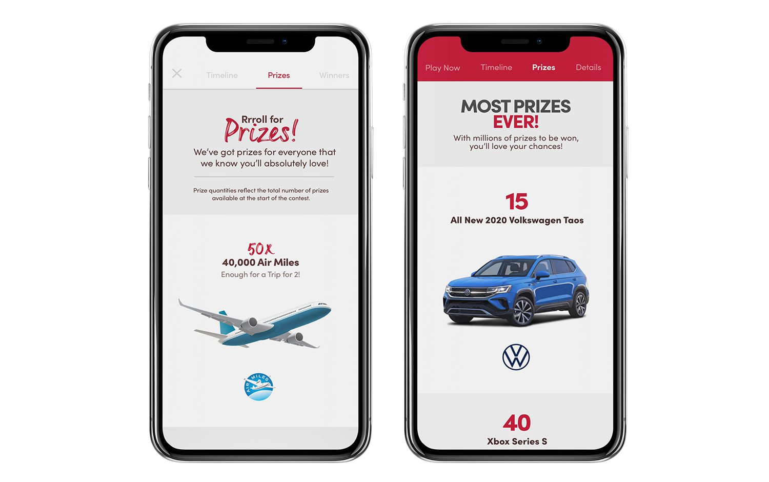 Navigation improvements: Part of the success of this game and experience was improving the IA and making it as quick and easy as possible to find what you’re looking for and start playing. Contextually, many users were playing this game as soon as they purchased their coffee in restaurant, which likely meant while walking, parked and even driving. Pictured on the left is the first version where all content pages were housed within a modal that users could tab through. Pictured right is the latest game in which the tabbed menu exists throughout the entire experience, until the user has initiated the game and gotten into the play experience itself. This streamlined the ease-of-use and didn’t force users into entering/exiting modals to read or learn about aspects of the game, view their history or share their rolls.
A scalable system for years to come.
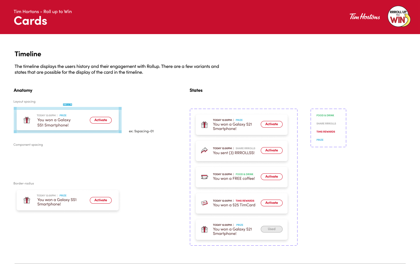
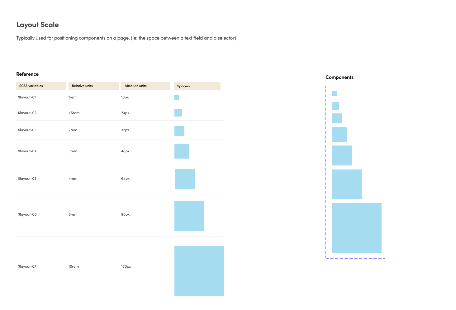
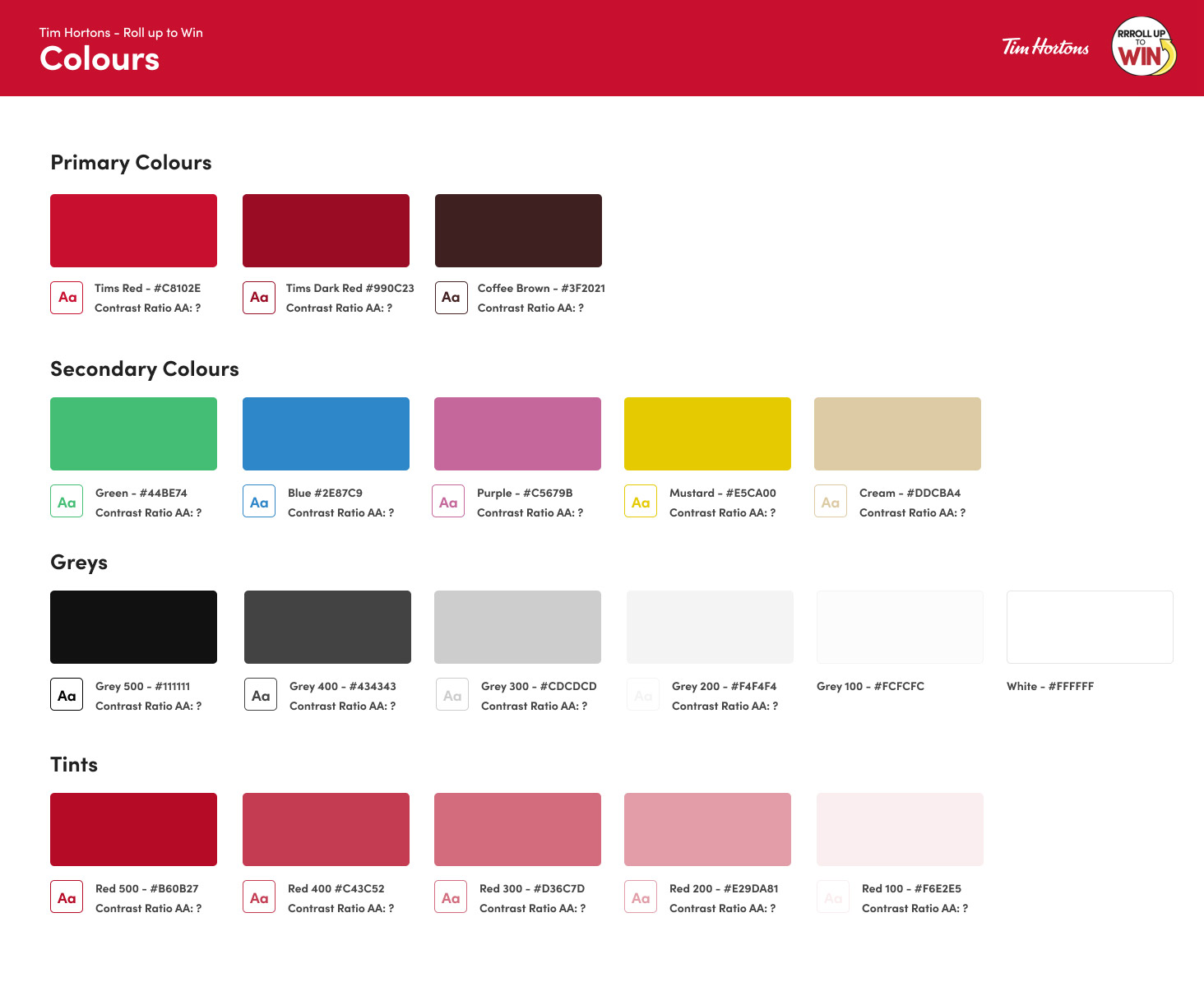
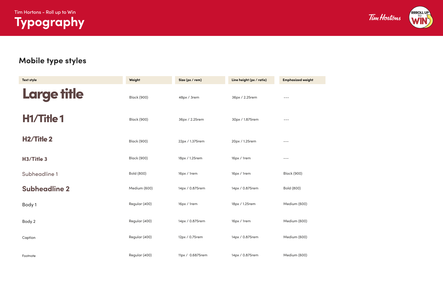
A component of this project was to work through a design system that was integrated with the development team and governed. Initially designed for the Roll up game only, I eventually expanded this system to include the other games designed at RBI. (NHL Hockey Challenge, Collect to Win and so on)
This design system outlined guidance on using the document, app foundations and components among other elements. This document was created in Figma, integrated with other teams at RBI and allowed transparency, consistency and one single source of truth for the design of campaigns at RBI.
ADDITIONAL ITERATIVE SAMPLES
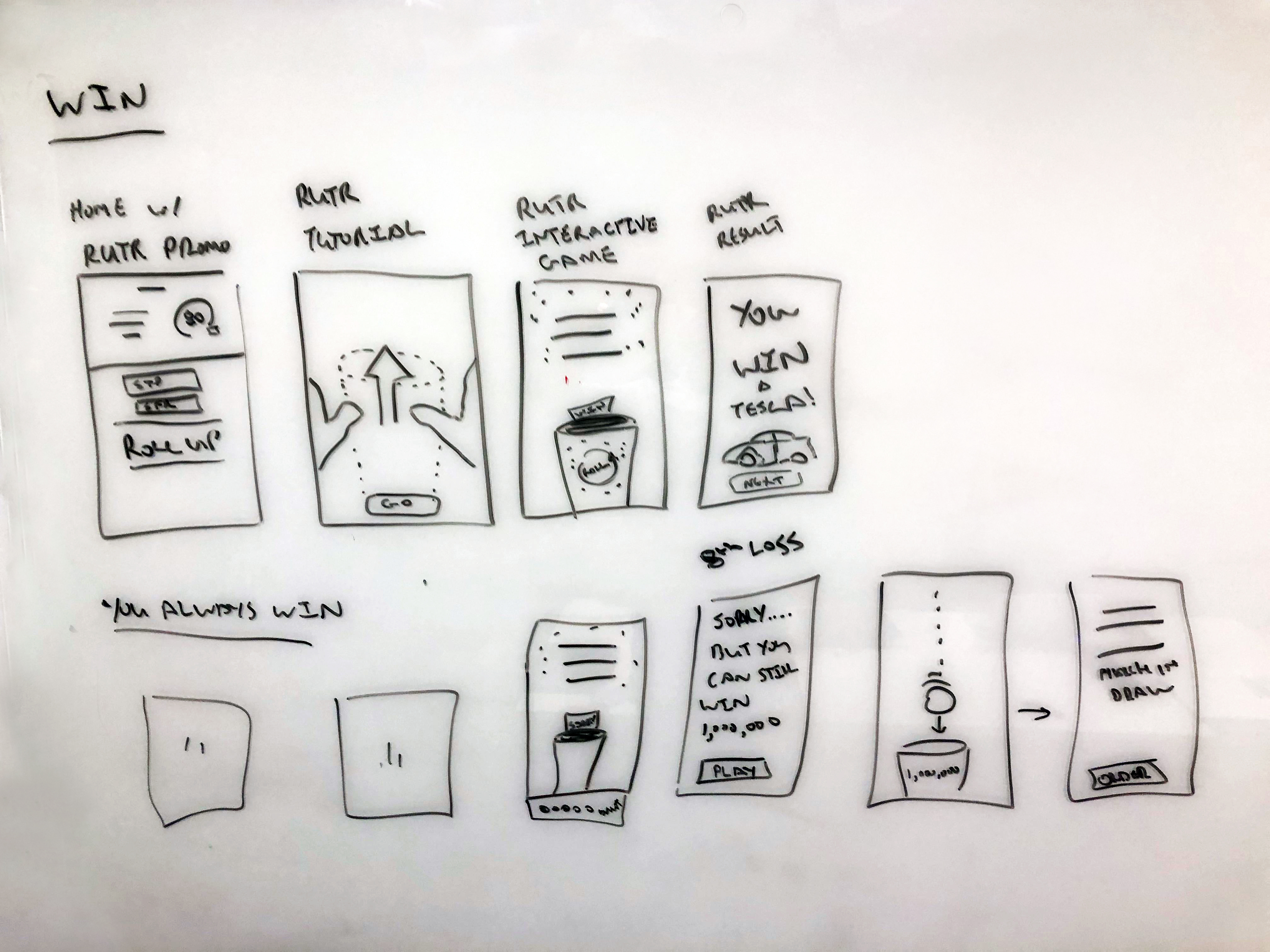
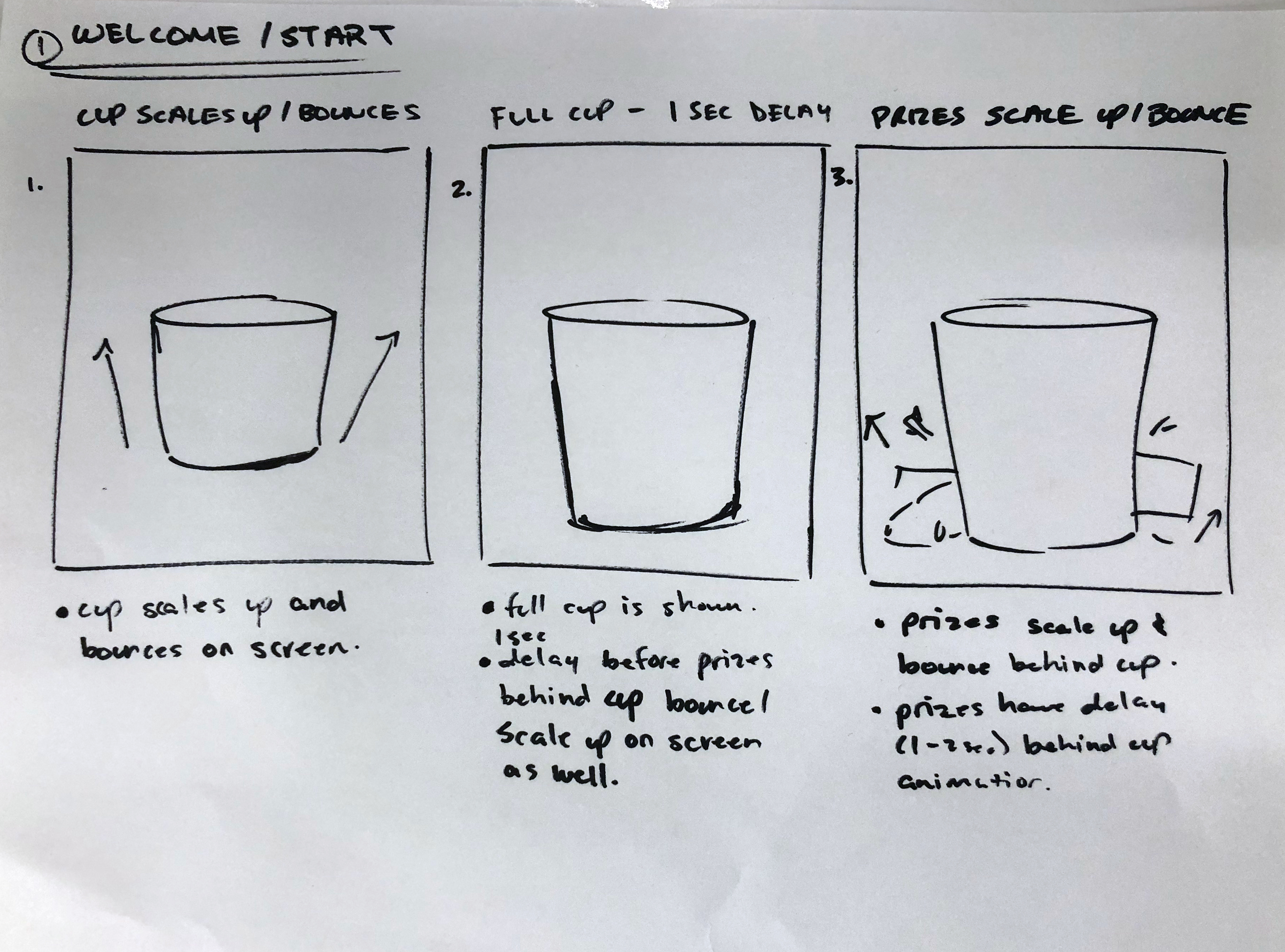
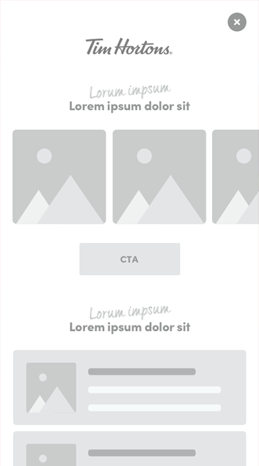
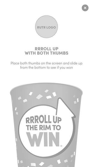
This project was carried out through many, many months which meant many, many design iterations. From strategy and testing to sketches and wireframes, to conceptual design and prototyping, this program showcased it all. Below is some of the very rough work that took part prior to finalizing and getting approval on the final designs.
