Tim Hortons – TimBiebs
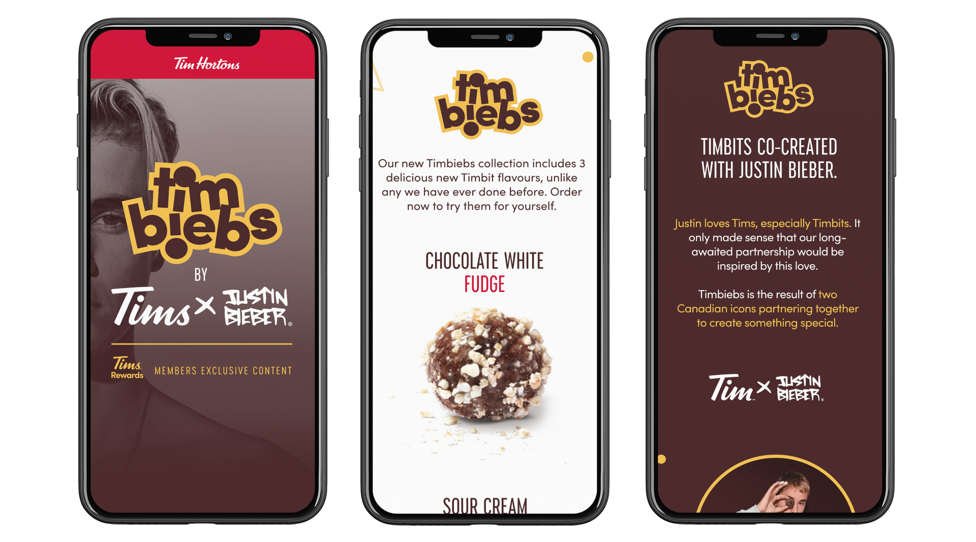
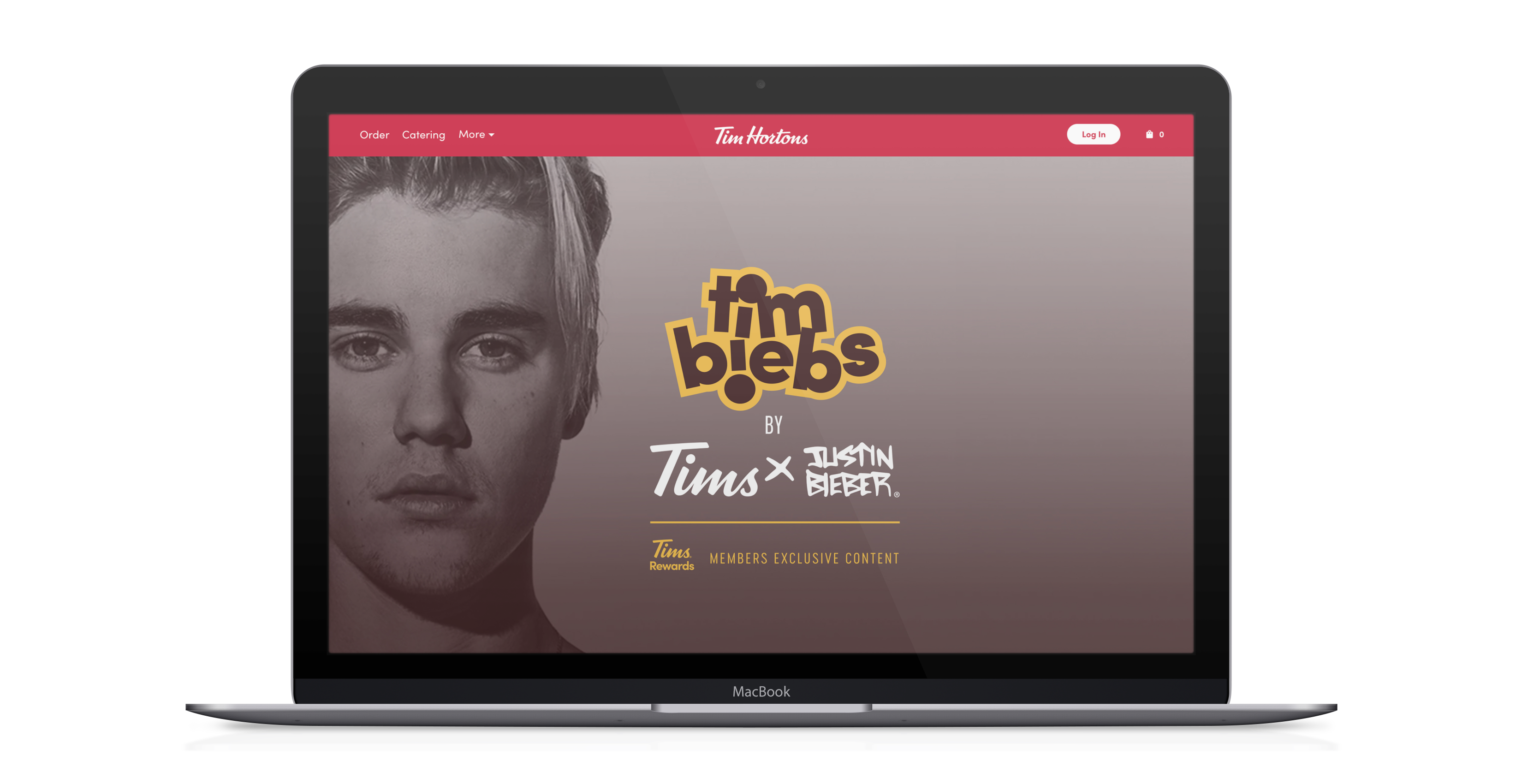
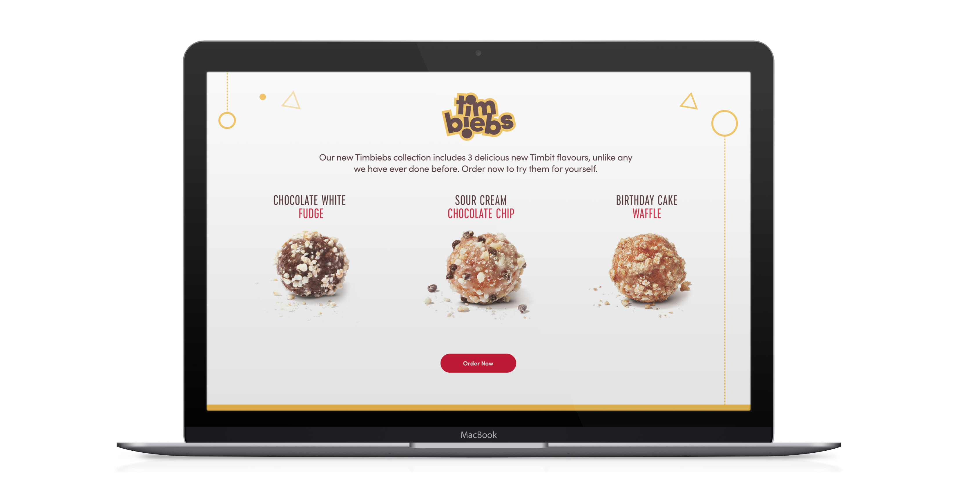
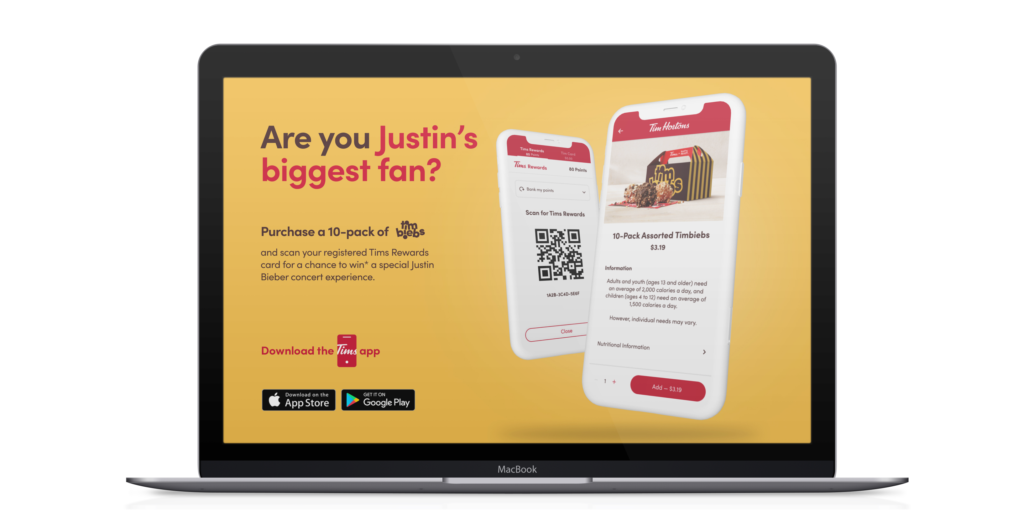
While at Tim Hortons, I had the opportunity to lead the design of the new TimBiebs branding and microsite. For those that are not familiar, Tim Hortons has teamed up with pop superstar Justin Bieber to launch three new Timbit flavours called Timbiebs — along with co-branded merchandise. The celebrity endorsement deal marks a departure from the coffee and doughnut chain’s usual lineup of professional hockey players, a marketing strategy that could help attract a different demographic.
My work included the design and strategy of the new microsite, UI kit and component library and motion graphics for the microsite. Tim Hortons traditionally used templated, restricted design layouts for their marketing pages, so much of this work was defining the new marketing template layout and user experience that Tim Hortons will be able to leverage for years to come.
Design Approach
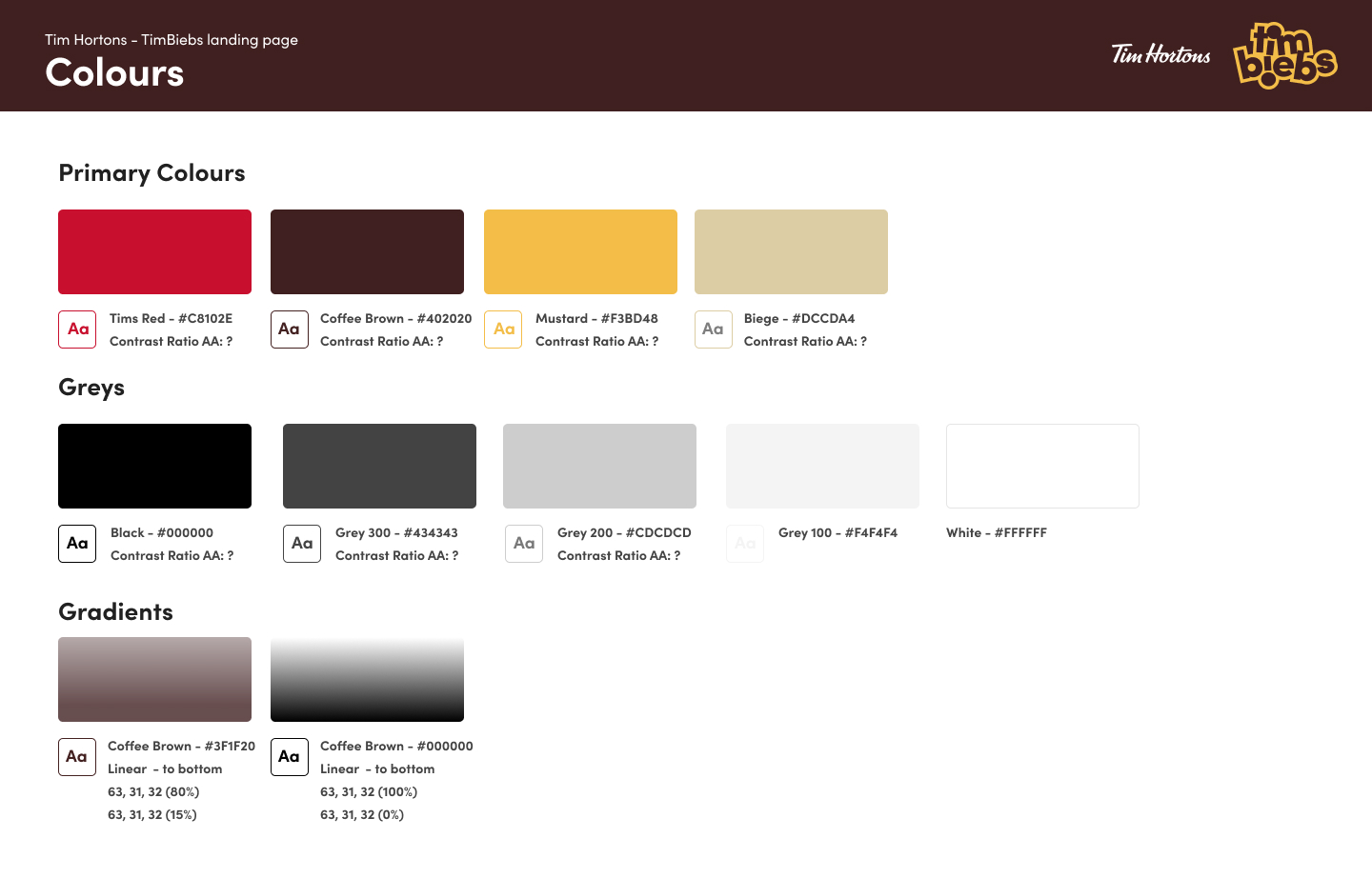
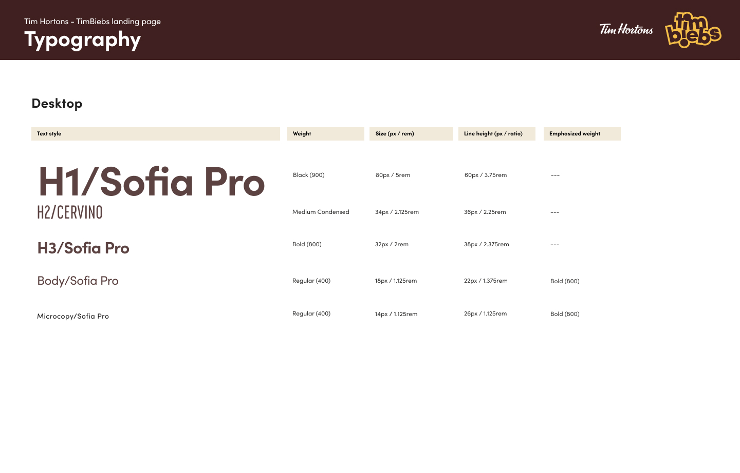
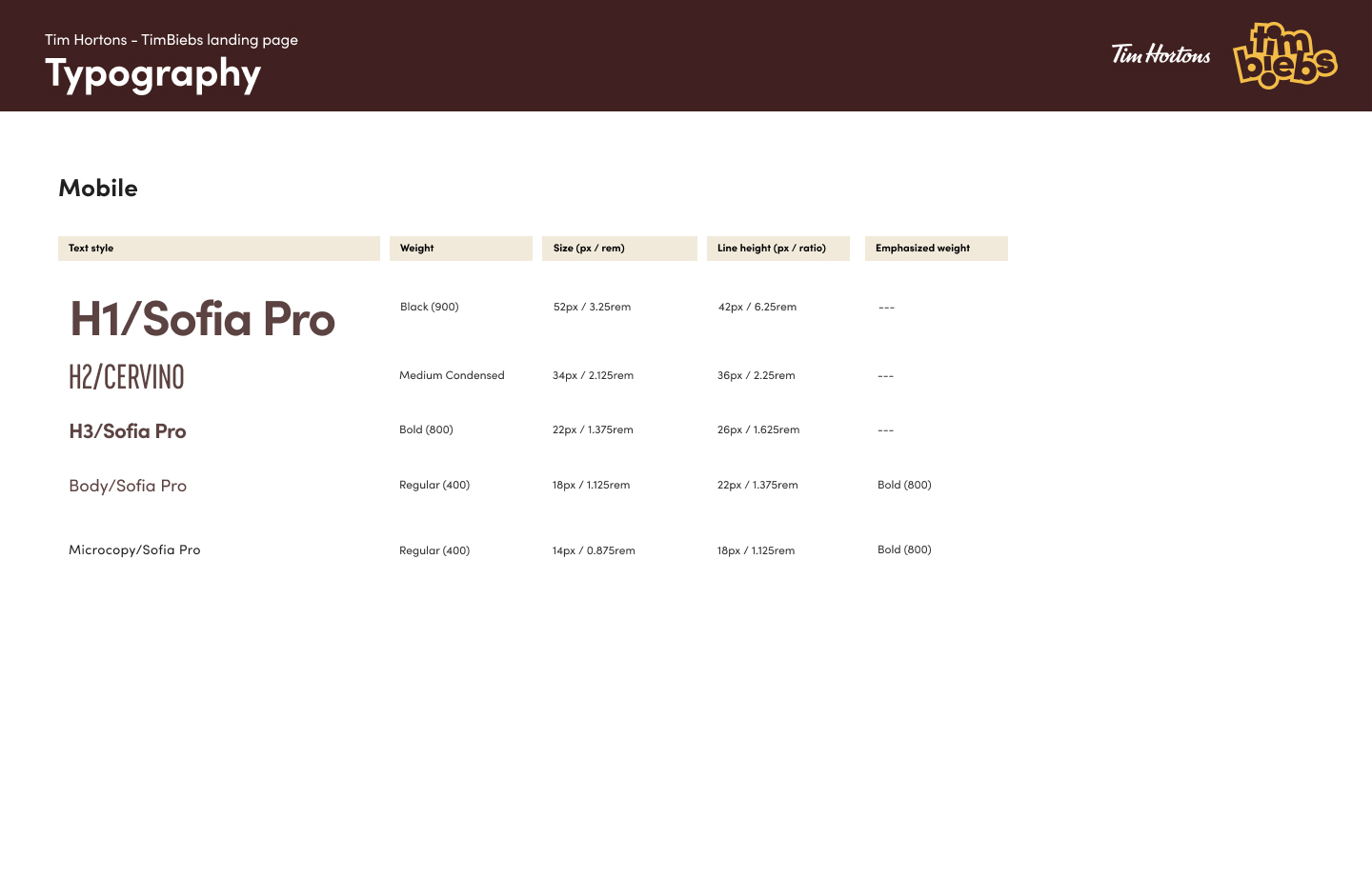
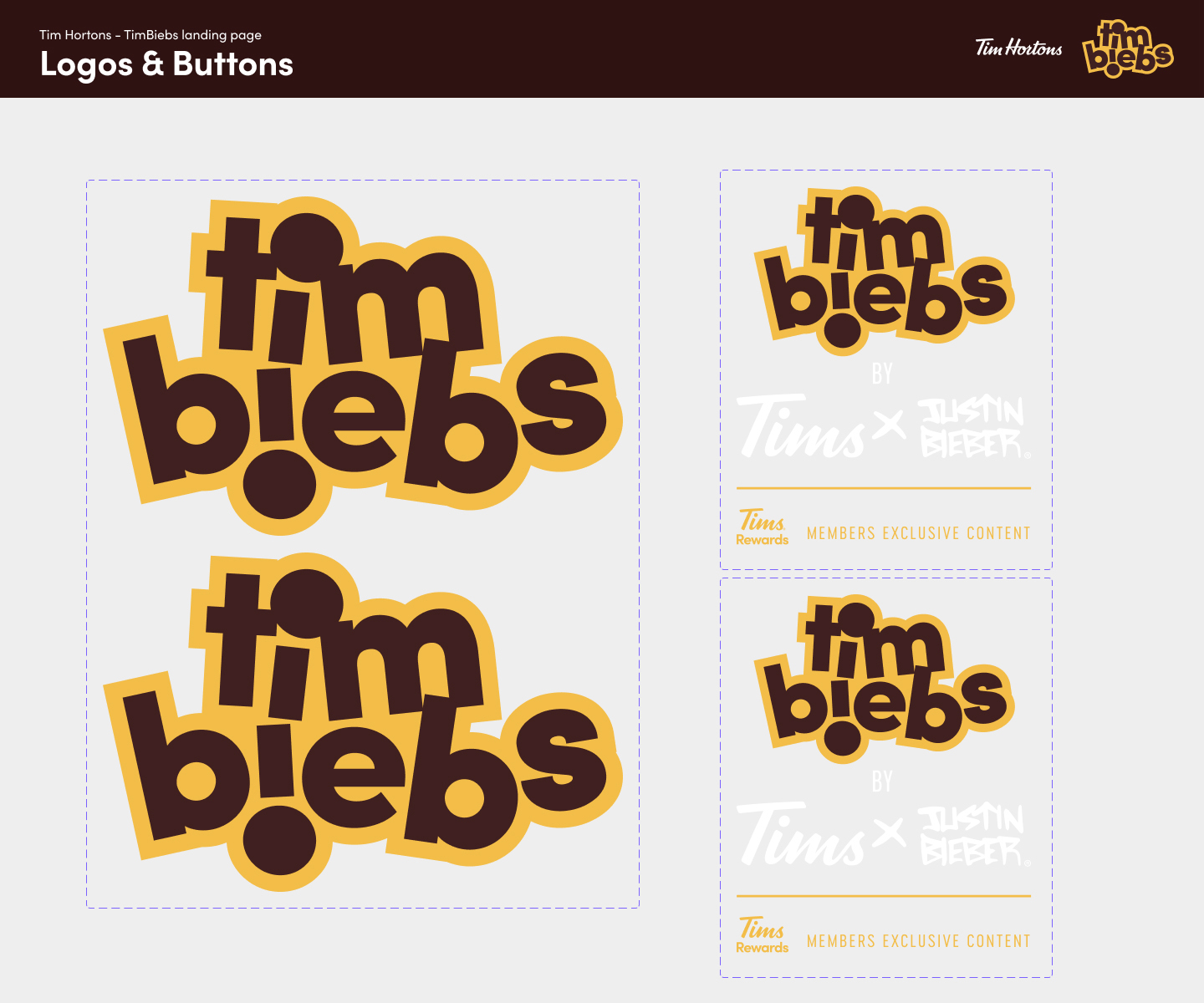
To supplement the design framework and visual identity, I produced a small component library in Figma for the development team and stakeholders to use for reference. The UI kit gave the page consistency, continuity and added a layer of accessibility guidelines to adhere to.
This wasn’t a fully fledged design system, more-so a light UI kit including typography, colour, spacing, grids, iconography, images and form styling.
UI Kit
To supplement the design framework and visual identity, I produced a small component library in Figma for the development team and stakeholders to use for reference. The UI kit gave the page consistency, continuity and added a layer of accessibility guidelines to adhere to.
This wasn’t a fully fledged design system, more-so a light UI kit including typography, colour, spacing, grids, iconography, images and form styling.
